#generating chart shape thumbnail
Explore tagged Tumblr posts
Visit Tumblr Blog
Explore Tumblr blogs with no restrictions, modern design and the best experience.
Last Seen Tumblr Blogs


Fun Fact
In February 2021, Tumblr had 518.6 million blog accounts.
Text
Further Development Project 1
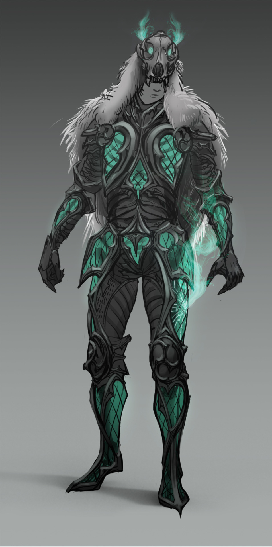
Of Myth And Notoriety/Lycanmancer
Post #2
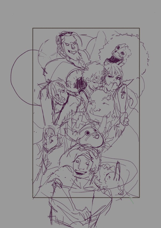
I've started exploring gravestone designs that would match my necromancer character concept. The necromancer has natural/druidic (through the wolf skull and fur cape) and Gothic (through the Gothic window-style armour) elements. Using the parameters from my alignment chart, where lawful should have Gothic elements, and Neutral should have druidic elements, I would say that my character is Lawful Neutral.
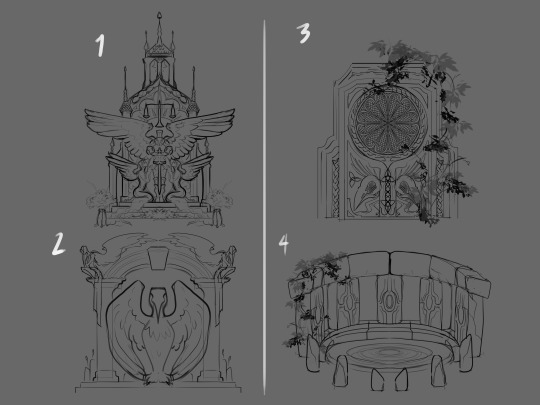
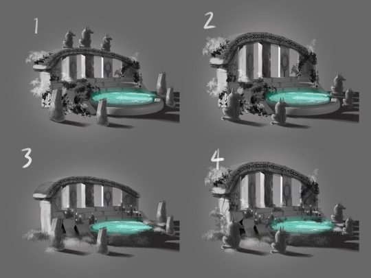
Concept 1 (below), although it uses sharp shape language, comes across as good and worshipful. Concept 2 was leaning toward Lawful Good again, but it is still too 'holy' with it's seraphic motifs. In concept 3, I used the Druidic and Gothic elements of my character, but the squareness is too stoic, it seems to be in conflict with the delicate glass of his armour. In concept 4 I decided to lean more toward the Druidic element by creating something not at all Gothic and more of a Good or True Neutral alignment through a memorial henge. I feel that these concepts are still relevant for the idea as these are props in motion that can change based on the character's choices in-game.
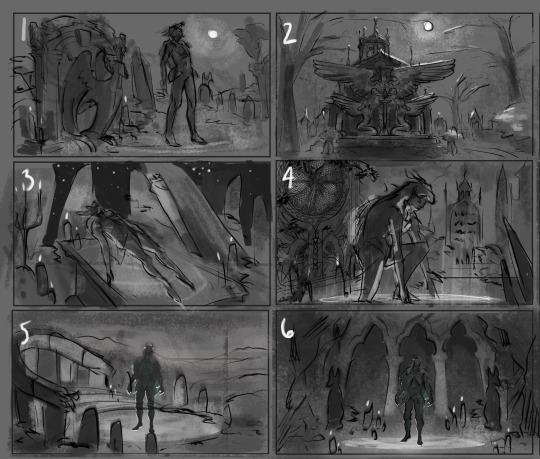
I incorporated the above concepts into thumbnails exploring composition, as well as a couple of new design ideas. I used some compositional types to help guide me in their creation.
I feel concept one is too unbalanced and too generic. The leering mausoleum in concept 2 is epic, but I couldn't figure out a way to incorporate the character in a way that would make them a focal point. I really liked the composition and angle of 3, I felt it was dynamic and intriguing, but I also think it's too cliche. I liked the character pose in 4, but with such a close up shot, I would struggle to show more of the environment and gravestone prop. I went with a diagonal composition in 5, the circular portal acts as a focal frame for the character, I really like the natural henge design for this one, and an amphitheater element makes it unique. In concept 6, I wanted to carved the mausoleum directly into a cliff-side with some intimidating angles and lighting, coming across as more evil and imposing. I really liked number 6, but felt it was a composition similar to another of my portfolio pieces. Taking these explorations into consideration, I've decided to pursue the concept of the Druidic henge, number 4 above, and composition 5 below.
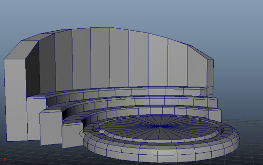
The henge design is simple, but its angles can be easily miscalculated if drawn free hand, so I modeled a basic mock-up in Maya to use as an underlay for further exploration. The accuracy of the 3D model helped elevate my concept sketches and also provided me with a little lighting information to inform the values. I rendered the angle based on the image I chose for the background by Tomas Robertson.

I incorporated the 3D model as an underlay to further conceptualise details of the henge design. There are subtle differences between the type of decoration and level of vegetation. I wanted to add more elements of my character to the design since I didn't include Gothic architectural elements, I did through his wolfish cape design and the wolf statues surrounding the henge. This also adds to the character's unique influences. I like all of the elements of concept 4 the best.
I made a start on the final concept through photobashing and manipulating pieces of Stonehenge (see stock images below) onto the 3D mock-up to ensure correct perspective.
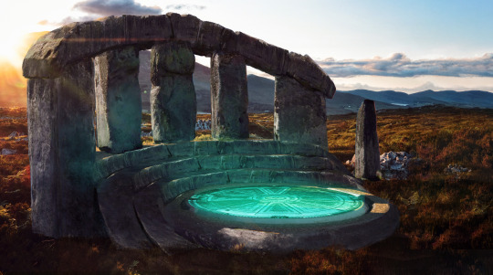
These are the stock images I used. The photograph of Stonehenge by Jonathan Ridley was particularly useful as the foreground stones contained similar lighting information that I need for my amphitheater. The Scottish highlands at sunset set the mood perfectly for my necromancer's summoning.


Image References:
DAZ STUDIO. (2015). Genesis 3 Male. [3D Asset]. DAZ 3D
Rawpixel. (n/d). Abstract gold sunburst effect background. [Photograph]. https://www.freepik.com/free-photo/abstract-gold-sunburst-effect-background_15559471.htm: freepik.
Ridley, J. (2020). gray rock formation under white clouds and blue sky during daytime. [Photograph]. https://unsplash.com/photos/gray-rock-formation-under-white-clouds-and-blue-sky-during-daytime--ZLDp: Unsplash.
Robertson, T. (2018). brown pathway near grass and stone. [Photograph]. https://unsplash.com/photos/brown-pathway-near-grass-and-stone-0kKcSc4dD7o: unsplash.
Spindler, S. (2016). gray building interior. [Photograph]. https://unsplash.com/photos/gray-building-interior-ippIhSrimC8: Unsplash.
textures.com. (n/d). 3D SCANNED STONE SURFACE - 1X1 METERS. [Online]. Available at: https://www.textures.com/download/3DScans0467/133923
TEXTURES.COM (2023). INKSMOKY0052 Image 3. [Photograph]. CC BY-SA. Available at: https://www.textures.com/download/InkSmoky0052/28558 [Accessed: 11 October 2023]
0 notes
Text
Version 545
youtube
windows
zip
exe
macOS
app
linux
tar.gz
I had a good week. I did some small things, and a user contributed some cool things!
full changelog
blurhash
tl;dr: we have some special blurry thumbnails now, but you won't see them much yet.
Thanks to a user who did a bunch of research and work to get this going, the client now generates the 'blurhash' of all files that have a thumbnail. This hash is essentially a micro-thumbnail, only about 34 bytes, that shows a very blurry coloured impression of the general shape of the image or video. They are usually used as placeholders when it may take time to load something--you have probably seen something similar on slower news websites.
You won't see these in hydrus itself much, since thumbnails load fast enough that we don't have to worry about placeholders. In the advanced ways of seeing files you don't actually own, however, I will now show you any file's known blurhash rather than the default 'hydrus' thumb. Same deal for damaged/missing files--if I can't fetch a thumb, I'll now fall back to the blurhash.
The more important thing is these hashes are now available on the Client API, under the normal 'file_metadata' call. If you are implementing a browser or similar and have access to a fast blurhash library, try them out! I've scheduled all users to generate the blurhashes for their existing files in the background, which will take a few weeks/months for users with hundreds of thousands of files (although, if you are working with this and want to hurry it along, remember the queue is manageable under database->file maintenance.
other highlights
The file history chart (help->view file history) now has a search panel, just like Mr Bones! You can search your import, archive, and delete history for creator x, filetype y, or any other query you can think of. Some of the math here got a bit weird, and I am sure I have missed out several 'cannot provide good numbers for this domain' situations, so let me know if you get any really stupid results or outright errors. There's more work to do here, like a button to hide the search panel, which I hope to push on in the near future.
Thanks to the same user above, we also have epub support! No 'num_words' yet, but it turns out epubs are just zip files with some html, so I think it'll be doable in future. Also, some rare incorrect jpeg rotations (for 'MPO' jpeg files) are fixed.
If you right-click on a selection of files, the 'open->similar files' menu now has a 'in a new duplicate filter page' command. This will initialise the filter page just looking at those files, hopefully making it simple to clear out the potential duplicates in any particular selection.
Unfortunately, I am retiring the Deviant Art artist search and login script. DA have been slowly killing their nice old API, and the artist search just went. Individual page URLs still seem to work, but I suspect they will be gone soon. Gallery-dl have a nice DA solution that works with the new API, so if you can't find the same content on a more open booru, that's my best recommendation for now.
next week
I want to take a very simple cleanup week. Nothing too exciting on the changelog front, but I'll refactor some of the worst code into something nicer to work with.
0 notes
Note
Hi! I hope you're doing well! I've been meaning to reach out to you for a while but I'm always so nervous! I wanted to tell you that I'm always so impressed by your animations and I wanted to ask if you had any advice? I would like to learn but I have no idea how to begin. How do you go about it and how did you start learning this process? Thank you very much and I hope all is well!
Hello!!! First off I want to apologize for it taking so long to respond to you- we had a lot of autumnal food storing to do and I was short on time. Animation is something I'm very passionate about and I wanted to give you a thorough answer because I would absolutely LOVE to help you get started in animating!! If there's anything I don't cover, or if you have a more specific question, feel free to send another ask and I'll get back to you as soon as I can. :)
I didn't really do much to get started, I just kinda jumped in with photoshop cs5 (I DON'T recommend doing that LOL 😂) I wanted to make an animated series with my brother so I just started working on the trailer which is like 30 seconds pffft. Since then I've just been learning as I go picking up stuff from watching movies closely. I've still got a lot of basics to figure out like thumbnailing a sequence before you try to animate it, and timing charts (which is what I'm trying to work on now hehe)
My biggest piece of advice for you would be to just jump into it! I think there is no advice that can get anyone started better than to just start doing it. I know that can sound daunting, but there is no better way to get better at any form of art (drawing, writing, singing, etc.) than to just start. You'll learn the best by learning from your own mistakes, as hard as that can be. XD
You can start with some simple exercises to get the hang of moving something, like animate a ball bouncing or a hamster doing a backflip- just whatever sounds most do-able to you. (Do yourself a favor and don't start with a walk/run cycle though. They seem simple but are actually one of the hardest things to animate lol Be smarter than me. XDD) Just start small and work up from there. Go from animating a ball to animating a blink, then animate something turning it's head, saying something, waving, flapping wings. The more animating the more you'll catch the hang of it and drawing the motions will become intuitive. In general, just don't be afraid to try- and if it doesn't look right, don't give up! :D
Richard Williams book, "The Animator's Survival Kit" is a wonderful resource for getting started animating. He walks the reader through the very basics, and then the fundamentals of animation and how to apply it, like squash and stretch and takes. I was able to find a copy at my library and then later bought one off Abebooks for around $12. I haven't finished the book but I did peek ahead and see lip syncing and walk cycles and other wider motions.
I've found a lot of art programs come with an animation system built in. I don't know what program you're using, but I personally love the one for Krita. I find the entire program intuitive and easy to use (that's also my drawing program XD), and the animation window is seconded only by ToonBoom (the current industry standard software which is also EXCELLENT just pricey. You can get a one month free trial for each of the three versions if you want to test it out. Unlike Krita, ToonBoom can make 2d puppets and do "flash" animation.) If you are having trouble with digital animation you can still practice with traditional sketches, I made a tutorial thing for a friend on that here. Flipbooks are something I've heard of working? Like animating on a pad of sticky notes, but I haven't been able to get that to work well for me but you could try it!
If you have any more specific questions I'd love to help you however I am able! Here are some of the resources I've found useful:
Again, I can't recommend enough Richard Williams' book "The Animator's Survival Guide" (an animator trained by Milt Kahl) if you want to understand the basics and are still confused where to start. Also Frances Glebas' (a renowned director) storyboarding book "Directing the Story". Both of those books have been immensely helpful and I can't wait for the free time to read them more and put to action the lessons! XD
Here's a link to James Baxter's (my animator hero lol) youtube account, where you can study snippets of a master animator's work: https://www.youtube.com/channel/UCt2iDOfRW1WWu5SxgJJpP1g
I've also found following accounts of animators on instagram has been a help, they'll often post "breakdowns" of shots explaining why they chose what shapes and how they decided to pace motions and stuff like that. jakeleeanimation this dude posts a lot of studies of disney animations kenduncan9 director of the studio that animated Tarzan and Hercules, among others pumbaaguy animator of Kronk and Pumba! framebyframe_animation this helpful account slows animations down and really walks you through the forms and pacing johnpomeroyart worked on Pocahontas and Atlantis, likes teaching people animation! theanimationart explanatory username lol XD AND OF COURSE aaronblaiseart who has retired from animating to TEACH animation and was also trained by the original disney pioneer animators. He does have a website where you can buy a course, and while it is pricey it does often go on sale. I haven't caught the chance to watch through all the episodes yet but I was able to purchase the series for $10 last year.
Also I seriously mean it, if you have any other questions feel free to ask. XD There's so much info I'm not sure where to start or what would be most helpful for you to get you started. :,)
22 notes
·
View notes
Text
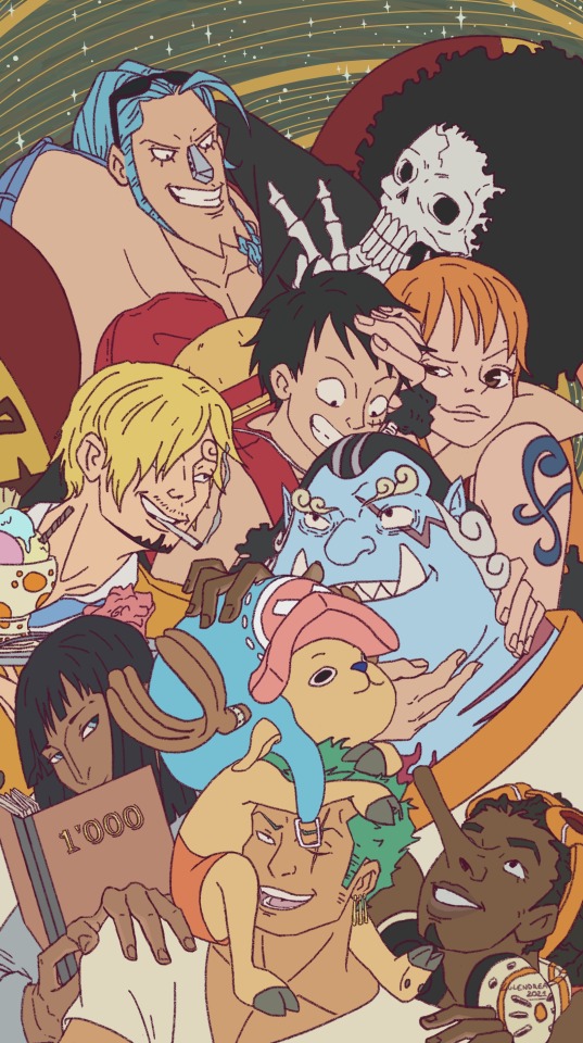


Process pictures for the previous piece (I'm really glad people liked it. I appreciate all the sweet comments people left in the tags ☺)
This was my first time actually doing the whole thing from start to finish digitally. I was always afraid of doing the sketch on the tablet, because it felt awkward and I had no patience for it. I always felt like I was a worse artist on a computer than with pencil and paper. But I'm glad I did this. It taught me that I can make a good piece if I just give myself the time and keep at it.
1 - Thumbnail.
I had actually done one more thumbnail before this one in my sketchbook, but it's basically the same thing, just really tiny, messier and just generally incomprehensible.
2 - First sketch
Building upon the thumbnail, I tried to get a better idea down and clear up some things. No reference at this point.
Between step 2 and step 3 there were a LOT more sketches done. I flipped the canvas a lot, made a lot of passes, and looked up references for the characters. Some of the characters came out really easily, like Jinbei (surprisingly), and others like Robin and Zoro just wouldn't come out how I wanted them to. Right now the only one I'm not happy with is Zoro (he just doesn't feel right to me).
I tried to also focus a lot on the composition. I made sure that the biggest lines and the eyes of the characters all lead back to Luffy. I also tried to make a clear path that would take the gaze of the viewer from Usopp all the way to Sanji, then from Sanji to Brook, then from Brook to Franky and then back to Luffy. I don't know if it really worked as I intended, but I hope so.
3 - Lineart (before clean-up)
I put in this step just because I wanted to show how much time I wasted making lineart for things that would ultimately get covered up. The problem is, I did every character separately. So I would first do a quick sketch of the character to get down the general position and composition in relation to the ones that were already made. And then I hid the layers of the rest of the characters and worked on the current one individually. Then once it was finished, I just moved it into place. This created quite a few tangents that I had no more energy to fix.
4 - Clean lineart
Nothing much to say here. I just erased all the lines that would be behind another character.
5 - Picking the colors from reference
I wanted to be mostly accurate to the source material, so I got a bunch of references and color picked the colors and then I just chose the average between those.
6 - Flats
Self-explanatory. Once I was done I had to adjust all the colors one by one, so they wouldn't clash against each other. Jinbei's skin especially didn't fit in with the rest of the colors. (Unfortunately I don't have the comparison of what it looked like before I adjusted the colors).
At the end the colors all looked different from the chart I made in step 5.
7 - Lights and shadows
Here I was really focusing on trying to make pleasant and clear shapes with my lights, which is why I'm showing it now without the lineart and the flat colors. So, I tried not to draw exactly where the light might realistically have been, but instead where it would show best the form and shape of the characters.
I set the lights layer (which I painted with a dark blue color) on divide and the shadows on multiply. (This was made in Krita, so I don't know how the layer modes might differ in other drawing softwares).
8 - End result
Final touches and details.
Also, I should say it took me roughly a month to make. (I'm extremely slow in general and me doing time-consuming things that I knew would not show up on the final piece did not help),
4 notes
·
View notes
Text
Book Making For Mac

Book Making For Kids
Book Making For Mac Pro
Choose a template
Pages includes two categories of templates specially designed for creating EPUB books. To choose a book template:
Apple Footer. Trade‑in value based on 2019 15-inch MacBook Pro. Trade‑in values will vary based on the condition, year, and configuration of your trade‑in device. You must be at least 18 years old to be eligible to trade in for credit or for an Apple Store Gift Card.
Set up your combination key. This key is also known as a hotkey or shortcut. The combination key is.
For crystal clear visuals, Mac laptops feature a thin Retina display with edge-to-edge glass. Offering speedy USB 3 data transfer, your Apple laptop includes a USB-C port that also provides charging and video output, allowing you to easily connect a variety of devices, including a portable printer.A sixth-generation Intel Core M processor combines with macOS for a system that generates minimal.
In Pages on your Mac, choose File > New. In the document manager in Pages on your iPhone, iPad, iPod Touch, or on iCloud.com, tap or click the New Document button .
In the template chooser, scroll down to the Books templates.
Choose the template that's best for your content:
For books that use mostly text, choose a Portrait template. With a Portrait template, you can choose to use reflowable text when you export to EPUB. In the exported EPUB book, text adjusts to different sizes or orientations of devices. Because of this, your book may look different from the original document when opened in Apple Books or other readers.*
For books that use a lot of images, or that format content in columns, choose a Landscape template. Landscape templates are exported to EPUB with fixed layouts. The layout is maintained in the exported EPUB book. The layout doesn't change depending on the size or orientation of devices.
* If you decide you want the layout of your Portrait EPUB book to match your document's layout, you can always export your Portrait template-based document as a fixed layout EPUB.
Book Making For Kids
Create a book in Pages
After you've picked a template you can add text, photos, image galleries, videos, shapes, tables, charts, and your own drawings to your document. You can record audio directly on a page in your document and listen to it in your EPUB. You can also animate drawings, which will play back in your EPUB. And, to make sure your book has a table of contents, use the Table of Contents view in Pages to add one.
With a Portrait template, new pages are automatically created as you add content. Your text automatically flows from one page to another. With a Landscape template, you must manually add a new page.
You can also copy a section from one word-processing document to another, or copy a page from one page layout document to another. Learn how to copy and paste pages and sections on iPad, iPhone, or Mac.
If you want text to flow from one page to another in a Landscape template, you can use linked text boxes.
Add pages manually
To add pages to a Landscape template on a Mac, choose Insert > Page.
To add pages to a Landscape template on an iPad, tap the Add Page button in the left column, then choose a page.
To add pages to a Landscape template on an iPhone or iPod touch:
Tap the page numbers at the bottom of the screen.
Touch and hold the thumbnail for the page you want the new page to follow, then tap Add Page at the bottom of the screen. If there is more than one master page for the template, choose the one you want. Otherwise, a blank page is automatically added.
To close the page thumbnail view, tap the handle above the thumbnails.
View and share your book
You can view and share your EPUB book in Pages on your iPhone, iPad, Mac, or online at iCloud.com.
Pages on iPhone or iPad
Open your document in Pages.
Tap the More button .
Tap Export.
Tap EPUB.
Tap Send.
To view your book in the Books app on your device, choose Copy to Books. To share your book, tap an app such as Mail or Messages.
Pages for Mac
Open your document in Pages.
Choose File > Export To > EPUB.
Click Next.
Select a location for your book, then click Export.
To view your book in the Books app on your Mac, double-click the book file. To share your book, select the file in Finder, click the Share button , then choose a method for sharing your book.
Pages for iCloud

Open your document in Pages.
Click the Tools button , then choose 'Download a Copy.'
Click EPUB in the window that appears.
Click Download.
To view your book in the Books app on a Mac, double-click the book file. To share your book on a Mac, select the file in Finder, click the share icon, then choose a method for sharing your book.
Book Making For Mac Pro
Publish to Apple Books
You can publish your book directly from Pages to the Books store in Apple Books on your iPad, iPhone, Mac, or online at iCloud.com.
Learn more
1 note
·
View note
Text
Convert Particular PPTX to PDF & Improved Text or Chart Rendering Support in .NET Apps
What's New in this Release?
Aspose team is happy to share the announcement of Aspose.Slides for .NET 18.2.0. There are some important enhancements and bug fixes part of this release, such as getting elapsed time required for converting presentation to PDF, The chart horizontal label looks different in the JPEG output, The axis major unit has been changed in the image output, the vertical axis label is not shown in the image output, When check LoadFormat, StackOverflowException occurs, Font file is locked after call to ClearCache method, Converting particular PPTX to PDF is too slow, Incorrect font when saving PPTX as HTML, Text overlaps when saving to HTML, Fonts in PowerPoint document and resulting HTML are different, PPS files detected as PPT, Animation Changed after saving PPT, Embedded fonts are not considered during saving presentation, Issue with zoom level of Notes Section and Outline while opening the saved presentation, PPTX to HTML not properly converted, Text is overlapped in table headers, PowerPoint comment text is not included in output, Shadows of rectangles in PPT disappeared and many more. This list of new, improved and bug fixes in this release are given below
Getting elapsed time required for converting presentation to PDF.
The chart horizontal label looks different in the JPEG output.
The axis major unit has been changed in the image output.
The vertical axis label is not shown in the image output.
When check LoadFormat, StackOverflowException occurs.
Font file is locked after call to ClearCache method.
Converting particular PPTX to PDF is too slow.
Incorrect font when saving PPTX as HTML.
Text overlaps when saving to HTML.
Fonts in PowerPoint document and resulting HTML are different.
Unsupported format exception after removing encryption.
PPS files detected as PPT.
Exception occurs when adding shapes to PPT presentation in multiple threads.
Animation Changed after saving PPT.
Embedded fonts are not considered during saving presentation.
Exception on loading presentation.
Issue with zoom level of Notes Section and Outline while opening the saved presentation.
Exception on PPT load.
The font size was changed from ’18’ to ’32’ after load and save a PPT file.
PPTX to HTML not properly converted.
ArgumentException on loading presentation.
Text is overlapped in table headers.
Power point comment text is not included in output.
Text in table cell incorrectly spreading into the next table cell.
PPT not properly converted to html.
Shadows of rectangles in PPT disappeared.
StackOverflow exception on generating chart shape thumbnail.
Presentation not saving and program just hang.
PptxReadException on loading presentation.
NullReferenceException when creating a hyperlink.
Other most recent bug fixes are also included in this release
Newly added documentation pages and articles
Some new tips and articles have now been added into Aspose.Slides for Java documentation that may guide users briefly how to use Aspose.Slides for performing different tasks like the followings.
Render comments when saving Presentation into Image
Implementing End Paragraph Run Properties for Paragraph
Overview: Aspose.Slides for .NET
Aspose.Slides is a .NET component to read, write and modify a PowerPoint document without using MS PowerPoint. PowerPoint versions from 97-2007 and all three PowerPoint formats: PPT, POT, PPS are also supported. Now users can create, access, copy, clone, edit and delete slides in their presentations. Other features include saving PowerPoint slides into PDF, adding & modifying audio & video frames, using shapes like rectangles or ellipses and saving presentations in SVG format, streams or images.
More about Aspose.Slides for .NET
Homepage of Aspose.Slides for .NET
Downlaod of Aspose.Slides for .NET
Online documentation of Aspose.Slides for .NET
#Convert presentation to PDF#particular PPTX export to PDF#save PPTX as HTML#adding shapes to PPT presentation#generating chart shape thumbnail#.NET PowerPoint API
0 notes
Text
Chemical equation maker

#Chemical equation maker mac
Move an equation within the flow of text: Select the equation and drag it to a new position in the body text, header, footer, or footnote. To change the look of the equation or to edit it, double-click the equation to open it in MathType, then double-click the controls at the bottom of the window.ĭrag the equation to reposition it on the page.Īfter you add an equation inline with text, you can modify it.Įdit an equation: Double-click the equation, make your changes, then click Update. If you added the equation to the page, it appears at the center of the screen and can be dragged to a new position on the page. To edit the equation, double-click the equation to open the MathType window. If you added the equation inline, it appears at the insertion point and is the same size and color as the surrounding text. To save your equation, choose File > Close and Return to Pages (from the File menu at the top of your screen), then click Yes in the dialog that appears. To enter the equation, click symbols and type in the MathType window.įor instructions on using the MathType tools, see MathType Help. Otherwise, click Use MathType in the dialog that appears. If you set MathType as your default equation editor, MathType opens automatically (after you enter an equation the first time). You can also click the page thumbnail in Page Thumbnails view. Place the equation so it can be moved freely: Click the corner of the page to make sure nothing is selected. Tip: To set MathType as the default equation editor, choose Pages > Preferences (from the Pages menu at the top of your screen), click General, then select the checkbox next to “Insert equations with MathType.” Drag the equation to reposition it on the page. If you added the equation to the page, it appears at the center of the screen and has a default size and color that you can change in the Format sidebar. If you change the size and color of the surrounding text, the size and color of the equation also change. If you added the equation inline, it appears at the insertion point in your document and is the same size and color as the surrounding text. Click Use Pages.Įnter an equation in the field using LaTeX commands or MathML elements.įor information on using supported LaTeX commands or MathML elements and attributes, see the Apple Support article About LaTeX and MathML support. If you have MathType installed, a dialog appears, asking whether to use Pages to create the equation. You can also choose Insert > Equation (from the Insert menu at the top of your screen). You can also select the page thumbnail in Page Thumbnails view.Ĭlick in the toolbar, then choose Equation. Place the equation so it can be moved freely: Click in the corner of the page to make sure nothing is selected. Place the equation inline with text: Place the insertion point in some text, a text box or shape, or a table cell, or select the text you want the equation to replace.
If you can’t remove something from a document.
Restore an earlier version of a document.
Save a large document as a package file.
Export to Word, PDF, or another file format.
Change the look of chart text and labels.
Add a legend, gridlines, and other markings.
Change a chart from one type to another.
Calculate values using data in table cells.
Select tables, cells, rows, and columns.
Fill shapes and text boxes with color or an image.
Set pagination and line and page breaks.
Format hyphens, dashes, and quotation marks.
Format Chinese, Japanese, or Korean text.
Use a keyboard shortcut to apply a text style.
Create, rename, or delete a paragraph style.
Bold, italic, underline, and strikethrough.
Populate and create customized documents.
#Chemical equation maker mac
Add, change, or delete a source file in Pages on Mac.Select text and place the insertion point.Use VoiceOver to preview comments and track changes.View formatting symbols and layout guides.Intro to images, charts, and other objects.
0 notes
Text
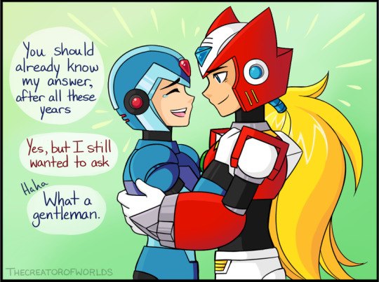
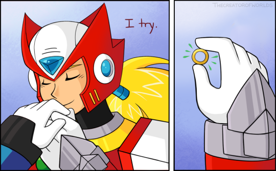
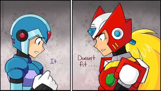
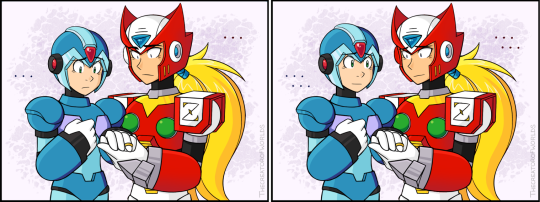
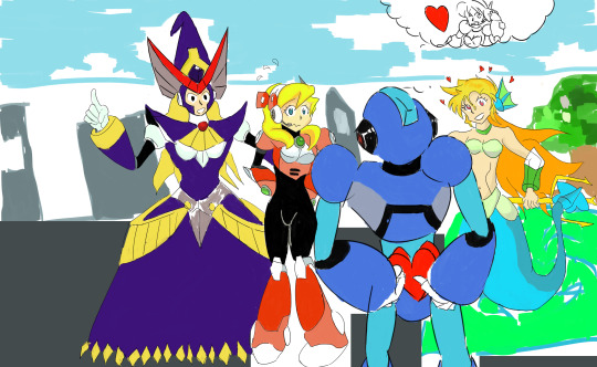
2018 Megaman Valentine’s Day Contest Results Thread!
Thank you all for your patience this year! I know this is a little later after the holiday than I would like, but one day is simply not enough to contain all this love! Once again, it’s always wonderful to have an assortment of both familiar faces participating, as well as many newcomers.
As always, this will be a rather massive thread, so bear with me. Most of it will be hidden after the break, so please do take a peek at all these wonderful entries!
Due to the size and sheer quantity of comic entries, there are plenty of images to view. For that reason, I’m sticking to thumbnails for now. Please click to view the entry in it’s full glory!
Also, my thanks to @jaybird-c for the help with judging this year. I’ll have some of his commentary with my own below.
The three raffle prize winners will be noted by their alias, as well.
For your reminder, there were two categories, broken down into Humor and Talent. There were 6 total Humor entries, and 14 Talent entries. So, to start off, we’ll begin with the category with the least entrants, and to fit with my tie-in promo art.

*EDIT* OK, now I think everything is good. So long thumbnails, to keep this shorter.
Once again, for an easy link to all the images in a single gallery, please go here: https://imgbox.com/g/uAbXkTDaot
Otherwise, I’ve tested it again on both mobile and desktop, and everything should link to a full image. It still does on my end.
*/EDIT*
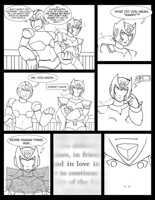
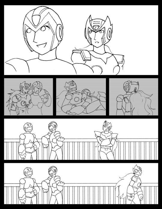
For Humor, this year’s theme was “Beauty and the Beastman.EXE.” The goal was to illustrate a mismatched Megaman couple, one in a monsterous, beastly form, with another more beautiful character that falls for them. Any allusions to the popular tale of Beauty and the Beast were welcome, but not a requirement.
Here are your top 3, followed by the remaining entries in alphabetical order by alias:
1.) @prar-draws: (*Prar wins $100 USD or an item(s) up to that value.)

Jaybird wrote: Prar's comic has the absolute best execution of a joke, increasing the tension until the last panel when it masterfully throws the audience for a loop. Prar's style complements the story very well by making each individual moment easy to digest, and the last panel also just happens to be really funny to look at on its own. Just thinking about it makes me crack up.
Miyabi wrote: While this piece really contains more tension and drama until the final panel, I agree that the build is what helps bring the big laugh at the end. You can also see the temperature rising for Ciel, as her cheeks get redder and redder as the panels move along. I felt it tied in to the Beauty and the Beast storyline nicely, and your chosen characters fit well to pull off the connection. Very cute, and well constructed comic!
2.) @amiable-apparition: (*a-a wins $50 USD or an item(s) up to that value.)
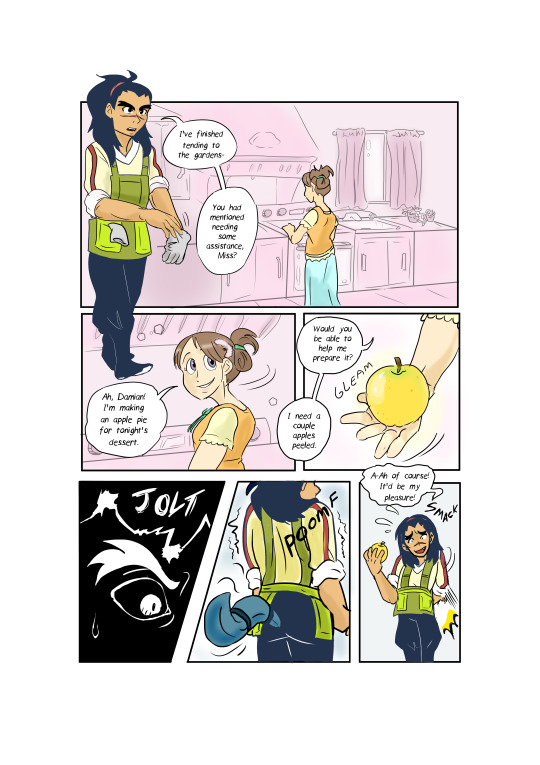
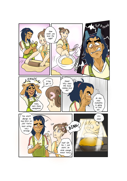

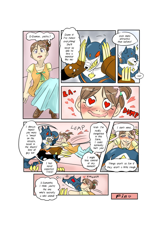
Jaybird wrote: I don't remember this scene from the Star Force anime. Must've been cut from the final release. Clever use of trickery regarding who the real "monster" is; poor Damian appears to have misjudged the situation something fierce. Good idea and use of twist.
Miyabi wrote: I guess Sam was the one who was ‘Hungry Like the Wolf,’ after all! I too enjoyed the spin at the end, it was a funny deviation on how her character was portrayed in the anime. Subject choice was strong here too, connecting the theme with a couple characters who fit well with the concept. Nice work with the variety of panels you created to set things up.
3.) @frankenchio: (*frankenchio wins $25 USD or an item(s) up to that value.)
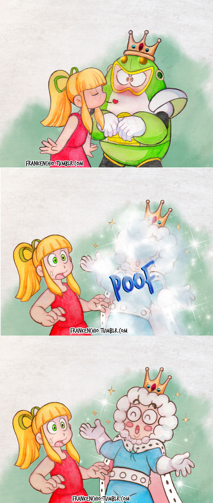
Jaybird wrote: Ah, the Princess and the Toad Man. Frankenchio's piece is a clever little reference to the classic fable, but most of the humor is in how Roll apparently didn't know what kind of prince was on the other end of that frog. Clever, pretty to look at.
Miyabi wrote: I like that you thought outside of the box with the theme, and used a totally different classic tale, but still connected it very well. Ice Man sure lucked out this time, after whoever cursed him into Toad form. While a simple few panels, your style is just adorable. Those jewels on the crown look really detailed!
Close, but not quite ~
Dark Dullahan:

Jaybird wrote: Dark Dullahan has the idea of recreating an actual Disney scene with Iris and (Zoanoroid?) Zero, which is very sweet. It took me a few repeat looks to digest what was going on here but it's amusing to see Zero protecting his wounds from the fierce and terrible Iris. Because she's obviously the worst thing that can happen to him. Cute, amusing scene.
Miyabi wrote: Sorry, I don’t know why this upload defaults to a side view, when I don’t even have it at that orientation. It automatically glitches that way, no matter how I upload it. :/ Anyhow, a clever spin using the EXE versions of Zero and Iris, living in a world where only reploids...no wait, they don’t exist here. This Beastly ZoanoZero will open up to her over time, I’m sure. But first, he needs to heal up. Again, good use of parodying the scene.
@drewblossom:
Jaybird wrote: The sheer concept of Rock-Belle made me wonder if they were going to throw in an FMA reference somewhere, but Drew's picture doesn't need it. They make good use of the Disney-classic-gone-wrong idea -- Oil Man and Time Man as Lumiere and Cogsworth are nearly inspired --though I think they didn't quite go far enough and should have rounded out the piece with a more feminine version of the suit; Rock-Belle changing into Mega *Man* raises questions about whether the main character's an actual girl or just a cross-dresser, which distracts from the joke.
Miyabi wrote: I guess Rock is both the beauty and the beast, for totally destroying those poor innocent talking inanimate object bots! While I had a good laugh at the quick-change blast, the character reactions, and the overall parody of the classic scene, sadly I did feel it just didn’t quite have the couple contrast/Valentine’s theme as well as others.
@erekisaiko: (*RAFFLE PRIZE WINNER* Captain N Height Chart)

Jaybird wrote: I feel like I'm missing a reference to something else. As amusing as the concept of JunkMan's and Meddy's unsanitary hospital sounds, the picture doesn't present us with enough information to make sense of what actually happened (i.e. why was JunkMan wearing a cardboard Falzer costume in the first place?), and [=ClockMan's=] joke lacks the punch it ought to have because the punchline has no set up. (Unless of course this is all just an incredibly obvious reference to something I've never been exposed to that would fill in all the missing context). Amusing concept in punchline, it's fun to think about how this situation could've arisen.
Miyabi wrote: Meddy’s not oblivious, she just has a big heart ready to heal any messy, junky slob! Cute and different idea having more of a ‘fake’ beast, although I think Junk still would count as a beastly character on his own, in some respects. Very well-drawn, and appreciate all the detail you put into your internet background.
For the talent category, the theme was “If You Like It, You Should Put a Ring Boomerang On It.” This category was all about proposal scenes. And I am shocked there was not a single Jewel Man! XD
Here are your top 3, followed by the remaining entries in alphabetical order by alias:
1.) @wintesm: (*wint wins $100 USD or an item(s) up to that value.)


Jaybird wrote: Jeez. Unrelenting Style. Your children's book painting is incredible as ever; your figures, your colors, your atmosphere, just about everything. I ran into a problem with your composition, though; the stark black page divider clashes with the predominantly horizontal-mirror structure and makes it hard to wrap your head around the story as its meant to be told. It was less of a problem once I trained myself to ignore it, and you use the divider very effectively in the second-to-last section, but it still made it harder to enjoy the work. Masterful technique, colors, perspective, expression.
Miyabi wrote: With your subjects, I felt this composition was a very clever way to tell the story, and kinda mirror their separate, but similar tales side-by side. As mentioned, you have such a fitting children’s storybook style, from colors to shapes, that shines once again! It’s a cute tale for such evil characters!
2.) @peach35: (*peach wins $50 USD or an item(s) up to that value.)
Jaybird wrote: Peach deserves a lot of credit for her mastery of figure-drawing and perspective. That's something a lot of people struggle with, and accomplishment in these matters should be recognized. Another good choice of simple background to highlight the main moment, and awesome use of colors and lighting to suggest 3D -- I'm far more fascinated by Gate's nose than I should be. Incredible faces, hands, colors, and general shading.
Miyabi wrote: The sense of confused shock on Alia’s face is a different reaction that most, as it’s apparent Gate is slipping that ring on in total surprise. Clean lines and soft lighting helped this piece stand out.
3.) @tianura: (*tianura wins $25 USD or an item(s) up to that value.)


Jaybird wrote: Tianura's style is difficult to read; the line quality can be inconsistent from panel to panel, some attempts to convey 3D positioning could use polish, and the panels never stray very far from simple torso and head shots. That said, the expressions are exceptionally clear (again, look to the eyes) and convey lots of emotion, and the page-by-page composition is very good. Very expressive faces, judicious use of colors for effect.
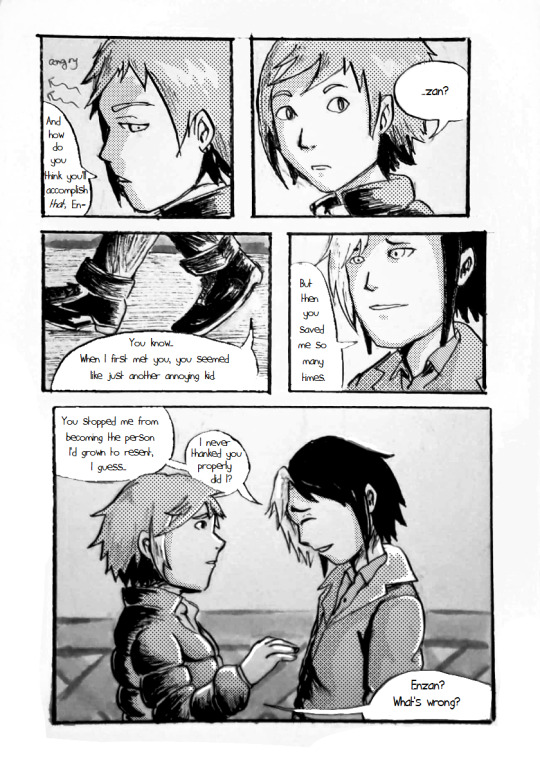
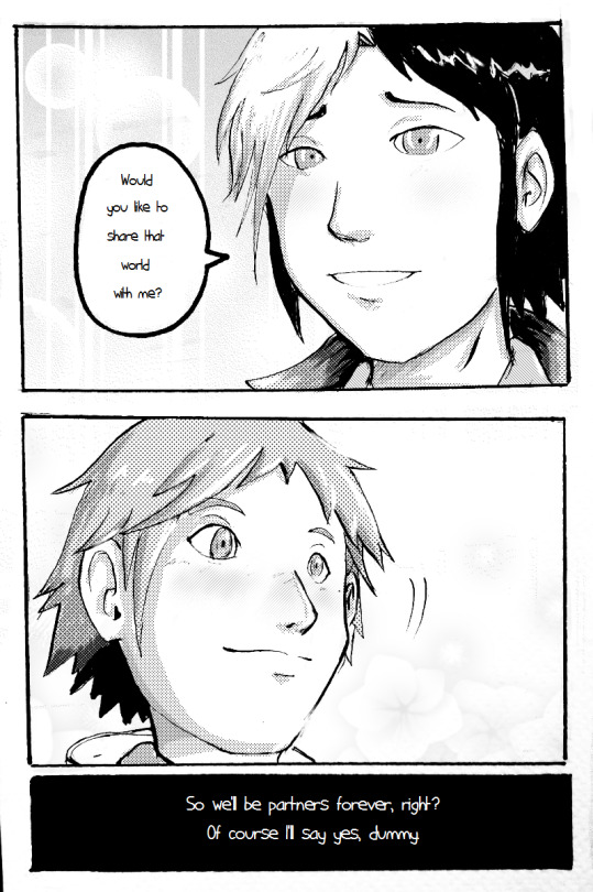
Miyabi wrote: I thought this was a creative parallel for life-long partners in using Netto and Enzan. You did a nice job keeping Netto’s goofy charm intact, with quite a few humorous lines. The ending was totally fitting for him, older or not. XD While I’m sure you would have liked to color the whole thing, I liked the differing use of screentone shading. And the watercolor look of the color pieces did give it some storybook charm as well.
Close, but not quite ~
@borockman:

Jaybird wrote: It's such a shame this isn't a humor category, because this deserves major points for funny (the Nana-Sigma romance anime that the fandom doesn't want, but nonetheless deserves). The linework itself is pretty good. Expressive, good use of background for mood. Also, Sigma, the ring goes on the ring finger.
Miyabi wrote: It’s a dream. It’s always a dream! Siggy puts the ring on her pinky because Nana’s his ‘lil pinky-poo... ;p With the tears running down her face, I really did like the emotional feel of the moment.
@digitallyfanged:

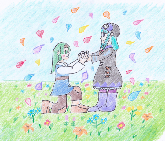
Jaybird wrote: In terms of sheer atmosphere, this is one of the best pieces. It looks like a still from some fairy tale picture-book. The forest scenery, the background, the flower-swing, the misting breath, the quality of the outfits and the details on the dress and sword all make this exquisite. Unfortunately the characters aren't quite as expressive as they ought to be -- this is very clearly a fairy-tale love scene of some kind, but what kind? Laika is clearly being emotional towards the princess, but what is he saying? "Who are you"? "You're beautiful"? "I love you"? "Be mine forever"? It's gorgeous, but it's a little too vague to tell whether it's on topic or not.
Miyabi wrote: Gorgeous scene that felt a bit like another Disney-ish tale, moreso of the Frozen variety. They may just be easy-to-use Clip Studio effects, but I really thought it was quite creative how you pulled off the swing design. The watercolor forest background is beautiful, as is Pride’s snow princess outfit. Pretty, pretty picture!
@drewblossom:
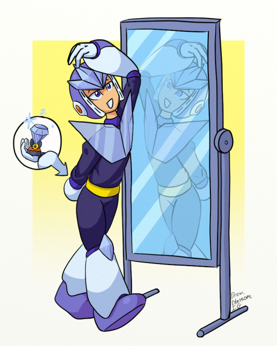
Jaybird wrote: I'm glad I saw Drew's title, because it took me a minute to figure out exactly what was going on -- for a moment I thought Geminiman was trying to propose to himself with that (fittingly) gaudy diamond. The linework is pretty good, and I like the lighting effects on Gemini's crystals and the translucence of his chest plate. I'll give them points for an ambitious concept, but the best mirror art looks at a scene from two different directions, and Gemini's reflection is simply a reverse of the main view. Good colors and lighting, elegantly simple background that does a good job of highlighting the main action.
Miyabi wrote: No better way to practice a proposal than to recite it in front of your self. Of course, if he is proposing to his clone, then I think with his nonchalant actions, he’s got this down already. XD Clever, and unique!
@hyperbole1729:
Jaybird wrote: This piece is another mix. It has some very nice things -- the colors are spot on, the composition is very nice (you take cues from the 18th century Romantic movement by having the whole world revolve around the subject), you clearly pay attention to character details, and your field of flowers is great.
Miyabi wrote: Another set of net-battling partners who seem like a great choice for being together forever. The background is a fitting place for Sal to do it, because I don’t quite see Miyu being the one to speak up and propose. That might be more of a frightening proposition. LOL Cute, traditional scene.
@iris-sempi:

Jaybird wrote: Iris-sempi's got style. The colors are interesting, the subject is clear, the linework pops out because it's -also- part of the colors, the cartoony elements fit in very nicely, and the presentation as a literature/manga cover is well-done. The technique is some of the best I've seen. That said, I have to ask, if you were going to go through all the trouble of creating such a cool cover, I think it's only fair to point out the title is blocked by the artwork, which defeats the purpose, especially on something's Volume 1.
Miyabi wrote: Just to clarify for everyone, the Japanese characters for this piece say "Let's Get Married" and "Sea Salt Honey." I thought it was a really clever mag cover format, where the characters really pop out against the pink background. With the waves, it really does feel like Splashy leapt out of the ocean to smack some salty sugar on Honey/Vesper Woman. Her vibrating antennae give some nice movement and comedic effect, too. Love it, but felt it just didn’t quite have the proposal feel as strongly as others.
@jb-artist: (*RAFFLE PRIZE WINNER* - Megaman 8 cel)

Jaybird wrote: JB's picture is very cute, and we don't have much actual oekaki here, so props. While you deserve even more props for how direct you are to get to the point, it's difficult to judge how we're supposed to interpret this -- is Alouette precociously misunderstanding the nature of a marriage proposal or is it an actual proposal to her older sister figure? The perspective rocks, the colors and lighting are good, and there are lots of little details that portray lots of love for the Zero series.
Miyabi wrote: Zero’s such the silent, brooding type, that he sends Alouette to do the proposal for him. I’m just not sure if that will help or hurt his rank in this stage! XD It is honestly really cute, especially when you see her doodles on the resistance base’s wall. I think that makes the piece more than anything, and was a clever callback to the game. I like how you set up the scene with the background, and those are some really nice mountains back there, too.
@lightlabs:

Jaybird wrote: Now this is pretty. Great composition to direct us through the piece (-nice touch- on giving the ring some bling) and rocking use of paint swatches for style. The art does a great job of directing us into the center, and the warm colors in the center do a lot to convey mood. Zero, you smug jerk, stop showing the rest of us poor schlubs up.
Miyabi wrote: Yes, this is happening. There is a reason for me to go on. What...what am I using this line foooorr? The warm colors and sparkles give it a unique glow, for what seems to be a night scene. The brush strokes give it a neat paint brush look, for your coloring, too. Nice work conveying their emotions with their expressions as well.
@pandapanic0:

Jaybird wrote: In terms of actual skill, the coloring is good and clear, the piece is composed well, the lighting effects are fairly elegant. If it were the actual humor category, the Ring Man's appropriately outlandish bid and Mega Man's exceptionally feminine reaction would gain the piece lots of laugh-out-loud points.
Miyabi wrote: Thank you for taking the title of this category literally and going for the humorous visual of a giant ring Ring Boomerang! Even if he says no, once he tries to get rid of that ring, it’ll just come right back. XD Rock’s blushing expression is cute. Nice crisp coloring and bold lines.
@shikai-the-storyteller: (*RAFFLE PRIZE WINNER* - Archie Worlds Unite Page)


Jaybird wrote: On a panel-by-panel basis, the art is very good: crisp lines; good color and lighting; good technique with hands and faces; great use of background and expression to convey mood -- you got more mileage out of your backgrounds than probably anyone else here.
Miyabi wrote: Another nice job of mixing humor into your piece, while still keeping it a tender, sweet moment. Nice way of showing that things don’t always go as planned for a proposal, but sometimes it’s the thought and effort that counts. As always, your lines, colors and penmanship are smooth and flawless.
Superbasket5:
Jaybird wrote: Aww. If I've got this right, it looks like X is so nervous about giving Alia a valentine that he doesn't realize Berkana is giving Alia encouragement as well. I think. I have to wonder what Marty is doing here -- research tells me she has a crush on X, which seems like it would get in the way, and if that's the case, this impending trainwreck will be something worth watching. That said, the piece is still in its rough stages, especially your setting and perspective; I can't really tell where the characters are (outside at a park?), and Alia's hip is in front of X's arm.
Miyabi wrote: Alia has her support group, but I don’t know if she’s going to be able to pop the question to X with a crowd around her, either. XD Cute expressions, showing her nerves, while X is probably not quite expecting what’s hiding behind her back. I kinda wish we would get that visual of what she’s hiding as a cutaway, much like how you gave X a thought bubble for what’s going on in his head.
@yugiohlesbian:


Jaybird wrote: Good job! I'd like to compliment you on how versatile your figures are and how you use that to make them very expressive; your use of perspective and individual panel compositions are both very versatile. While there isn't any color, the nighttime scenes do a good job with the lighting. Your style is pleasantly simple, but sometimes the panels seem to be oversimplified; more developed backgrounds would be welcome in several places.
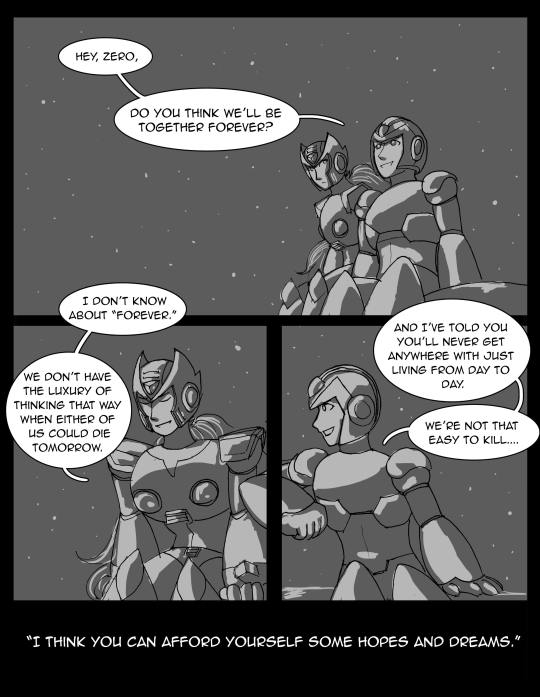
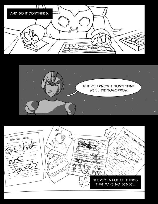
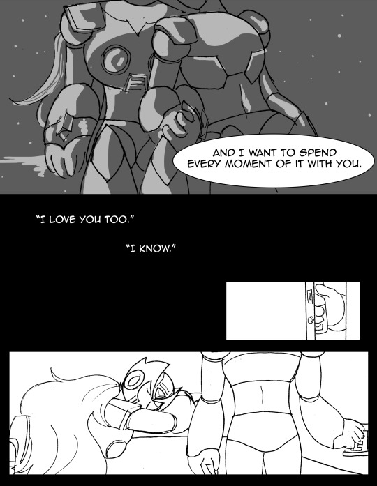
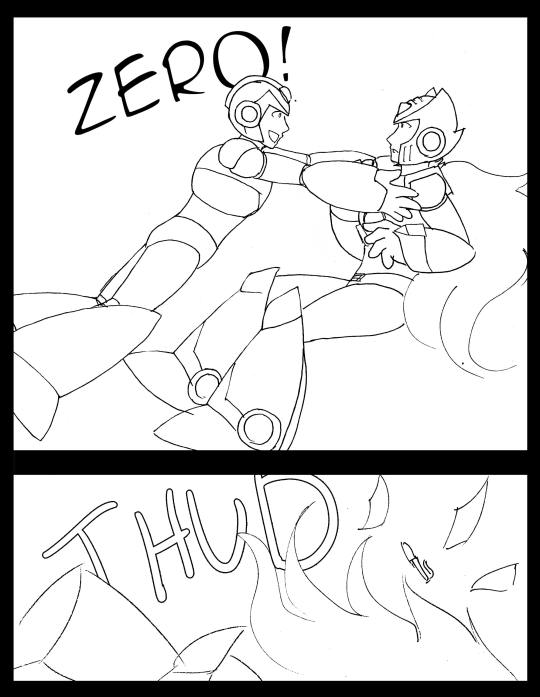
Miyabi wrote: Totally different subject, but Zero, none of us understand taxes, either. I like how you illustrated the struggle of a reploid trying to understand human logic and traditions, and yet in the end, it still being something Zero didn’t truly need to grasp in that logical sense. While I know you wish you would have had more time to continue perfecting these panels, I agree that the night scenes stand out and give a good contrast between Zero’s computer research scenes.
Thanks once again to all who participated! I will be contacting the winners soon enough. Work will probably keep me from replying to everyone immediately, but if you don’t hear from me today, I will send a message about prizes hopefully within the next day.
For those awaiting the secret contest results...sorry, for another slight delay. Between finishing my promo art for this thread, and typing this, it took up too much time and I’ve gotta head to work. I will have those posted overnight, into Sunday morning, as it won’t be quite as intensive to write up. My apologies, but I hope you can all hang on for another 20 hours or less. ^^;
68 notes
·
View notes
Text
Fast Travel In Mafia 3

Below is a list of characters found in Mafia III. 1 Mafia III 1.1 Major Characters 1.2 Minor Characters 2 Factions 3 Mentioned 4 Faster, Baby! 5 Sign of the Times 6 Stones Unturned. (.-) 4 out 5 stars. TLDR Top notch driving, yet no fast travel system which can be annoying. Drags on towards the end. Shouldn't mandatory side quests be considered mainline story quests. America wasn't/isn't great for everybody so have a blast giving it to some of your contemporaries crappy ancestors, or them directly.
Can You Fast Travel In Mafia 3
Can You Fast Travel In Mafia 3
Cheapest Way To Visit Europe
Is There Fast Travel In Mafia 3
Here are some mods fór Mafia 3.Car Customizations.No Back View Match / Speedometer.Minimal Hud.Ragdoll.Automobile Controls.Naughty Doggie HDR Light In Tonemapping.Switch Period Of Time.Manual Law enforcement Searchlight and Sirén.ToggIe Hud.M2M3 - Máfia 2 Major Menu SongMafia 3: Contemporary Cars (mod),Modern cars can become discovered in the games documents, I merely modded them in to end up being capable to drive them. They had been clearly certainly not meant to be interacted with and likely utilized for recording cutscenes. Bugged textures, mainly no noises, barely any harm versions and no functioning doors. Pointless but fascinating to discover.' Originally submitted by:Is quite unhappy to notice that the Mafia 3 group has better tips than the designers and can be for free!Doesn't this apply to basically all games these times and not just Mafia 3?
For Mafia III on the PlayStation 4, a GameFAQs message board topic titled 'This game needs fast travel!'
Most games nowadays have a huge community producing mods either increasing or enhancing the games.Developers, I'michael quite certain, have got a lot of concepts of what they would like to place into the sport, but since this costs a great deal of cash, ultimately, some concepts possess to become remaining out.And everybody have different tips of what they would like in a game, so designers might have one idea, and some neighborhood member another. And I think it't excellent to find that games today are open plenty of for mods. Initially posted simply by:Is very unfortunate to notice that the Mafia 3 group has much better tips than the designers and is for free!Doesn'capital t this apply to fundamentally all video games these times and not simply Mafia 3? Most games nowadays possess a large community producing mods either extending or improving the video games.Designers, I'meters quite specific, have got a lot of ideas of what they want to put into the sport, but since this expenses a lot of money, eventually, some concepts have to be still left out.And everybody have got different ideas of what they want in a game, so designers might have one concept, and some neighborhood associate another.

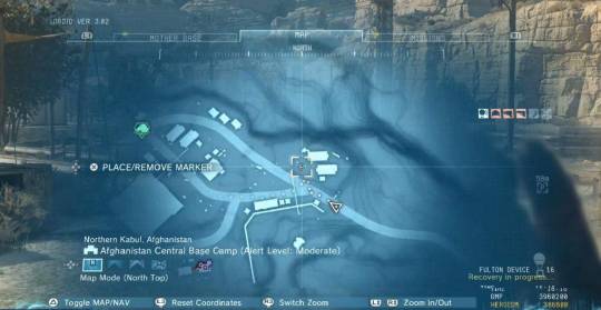
Today I'll be showing you how to fly in Mafia 3 using this Mafia 3 mod for the PC called Noclip. Noclip allows.
The world isn't so large that it needs fast travel. I understand in games like skyrim where the world is large and horse is fastest way of travel, but in mafia where the fastest cars can go over 100 mph, it's just not needed. Also, it's not like you have to slow down near the cops, just don't hit anyone near cops.
And I believe it'beds excellent to notice that video games today are open more than enough for mods.This video game Is various since it does not have a lot of functions that everybody believed that would become in the game. Originally posted simply by:Doésn't this apply tó essentially all video games these days and not really simply Mafia 3? Many games nowadays have got a massive community making mods either increasing or improving the games.Developers, I'meters quite specific, have got a great deal of concepts of what they would like to place into the video game, but since this costs a lot of cash, ultimately, some tips have got to become left out.And everybody have different suggestions of what they wish in a video game, so developers might possess one concept, and some area associate another. Install amiga os 3 5 winuae torrent pirate bay. And I believe it's i9000 great to observe that video games today are open good enough for mods.This sport Is various since it lacks a lot of functions that everybody thought that would become in the video game.' Leave out me from thát please, I'meters not missing any features.Anyhow, the absence of features must end up being applied to all video games where people create mods, which will not make Mafia 3 any different. And ultimately the programmers are usually the types that made the choice of what features they desired to place in the sport. The absence of some function could become as simple as the programmers didn'testosterone levels need to include that function in the video game, Probably didn't match the eyesight the had for the video game. Video thumbnail maker for mac.
I performed Mafia 2 (and 1 for that matter), therefore still, make sure you wear't speak for me by saying everyone.Look up any game on youtube ánd you will find movies of glitches and bugs. 80+ hrs and I rán into one motorboat being stuck inside the drinking water which can be the just game busting glitch I got, so for me, l can't say I got the amount of problems as you will find in a youtube video.The game for me can be not anymore repitive than many other video games. The greatest problem with these open up world games is definitely that it consists of a great deal of generating back again and on, but you can say the same with games like GTA or Just Trigger.The only AI issues I've seen, is arbitrary people strolling out on the road in front of you, just to cease in the middle of the street, rather of shifting apart from your vehicle. Originally posted by:I performed Mafia 2 (and 1 for that matter), so still, make sure you wear't talk for me by saying everyone.Appear up any game on youtube ánd you will discover video clips of glitches and pests. 80+ hours and I rán into one fishing boat being trapped inside the water which is usually the only game busting glitch I got, so for me, l can't state I experienced the amount of problems as you will discover in a youtube video.The game for me is not anymore repitive than many other games. How can anyone state this is definitely as repeated as any additional game?
Take GTA V for example, those missions were fun for the many component. JC3 will be repetitive yes !, but at Ieast it's fun, it's nót repetitive in thát scale as Máfia III is: drivé a long wáy, kill a féw dudes, drive á long way báck x 100. The devs were too lazy to actually include a fast travel choice in this gamé:D Like á cab actually. That wouldn'testosterone levels take much period.And the basic functions that shuold be in this game are missing. It't not about having more functions just, it's i9000 about carrying on with the series fundamental factors that have been presently there since starting.
You can't really take miracle for example away from The Elder Scrolls collection and state:'hey, we're doing something fresh, mods/upcoming up-dates will add that back in for you men!' Mafia as a gaming series places up a several goals (as every series of video games does), this video game failed many of them. After the initial awesome take action, this game is just dull revenge story, full of copy-paste tasks, and i can'capital t even modify my t-shirt before the dIc comes:DI purchased the collectors edition, and i repent it, that has been 130 euros tossed to them. And i got a game that's Iike gta III. Simply a slightly better images.
Originally submitted by dancefly:here are some mods fór Mafia 3.Car Customizations.No Rear View Looking glass / Speedometer.Minimal Hud.Ragdoll.Automobile Controls.Mischievous Doggie HDR Lighting D Tonemapping.Transformation Time Of Day.Manual Law enforcement Searchlight and Sirén.ToggIe Hud.M2M3 - Máfia 2 Main Menu SongMafia 3: Contemporary Cars (mod),Modern vehicles can end up being discovered in the games data files, I merely modded them in to be capable to drive them. They had been clearly certainly not meant to be interacted with and most likely utilized for recording cutscenes.
Bugged textures, mainly no noises, hardly any damage models and no functioning doors. Useless but interesting to see.' ' How to set up mafia 3 scripthook? All i would like is to end up being able to make use of the 'Cash script mod' ánd the 'all weapons script mod', help me please.
Welcome toMAFIA III is certainly the most recent installing of the MAFIA collection. This Subreddit provides a place to trade about the advancement, information and media. Launch Day ReviewslGNMetacritic (PC), Critic: 55Metacritic (PS4/Xbox), Critic: 60SteamGamespot,Note: Chart may become out of day as testimonials come away.Please read through the rules and take pleasure in your keep!1. Respect other customers and their views. Racism and insults will not really end up being tolerated.2. Format the title of any write-up containing potential spoilers like this illustration.
Be certain not to place the spoiler in the name!Instance of a good Title:'SPOILER I simply learned something insane about Lincoln!' Moreover tag the post as 'NSFW' and select the 'Spoiler'-Sparkle. Failure to tag spoilers correctly will effect in a bar.Use this to hide spoilers in the remarks:If you fórmat the spoilers Iike this:Spoiler: (#t 'Lincoln is certainly a shape moving lizard')The text message in the brackets will just be visible if you shift your mouse cursór over it:SpoiIer:3. Submitted content material must end up being directly associated to the MAFIA franchise.4. No memes/rage comics or identical low high quality posts. Maintain conversations in their particular mega-threads.5. Blog/YouTube spam, or junk e-mail in general is not allowed and will be removed.6.
No posting/requesting unlawful download hyperlinks, splits, or some other repacks. Conversation is alright, links are not really.7. Follow the general!Take note that all of the over is subject to moderator acumen and may become become a huge hit by messaging us.We try to make the moderation óf this Subreddit ás clear and democratic as feasible, so feel free of charge to send out a message if you possess any recommendations or feedback.We will not eliminate unpopular remarks. This is usually a place for discussion after all. Right here and right now there you will study a evaluation complaining that the game doesn'testosterone levels have got fast travel.
Fast Travel In Mafia 3 Release
This is a fairly lazy critique imo. Not really just in the literal sense.I can know that sometimes people really have got a really busy life-style and they want to reduce down on period consuming duties in-game, and just jump between the great bits. But for a game like this l can't find why I would want to do that.The cars (and the music) are usually outstanding. New Bordeaux is usually fun to discover. Every region has a different feel.
And most importantly, it doesn't take you hours to generate from one end to the othér,merely 5 to 10 minutes. Unless you really feel appreciated to abide by every traffic regulation or you're scared to phase on the gasoline and float into the sides. I wear't thoughts the lack of fast Travel either, but I think they do a shitty thing with those various goals.
What To Know Before Going To Europe
I put on't get why everyone of those vehicles and Moonshine vehicles wants to become in the Bayou. I get why the vessels are presently there, apparent, but they could've spread those vehicles and vehicles even more around the chart. How does this relatie?
Well, sometimes when trying to maximize a racket profits I just think like fuck, ain'capital t gonna drive all the way to the base of the map for a ridiculous truck transport to generate more kickback so I can purchase more weaponry. Those several times I do believe about fast Vacation, not hoping it, but it could'vé produced inspired me even more.
Each design has special traits that create generating it a unique encounter. This indicates not really all vehicles are fit for all reasons, therefore you'll want to change cars usually, based on the landscape and the job at hands. The best models are pretty uncommon, and knowing where to find them will conserve you a great deal of time. In this guide, we're heading to show you the greatest car locations in Mafia 3.Mafia 3 Best CarStealing vehicles will be one of the fundamental activities in the sport. You'll do it all the period.
Portrait Professional is a software that comes bundled with professional tools for creating portraits. Windows 10 32/64 bit Windows 8 32/64 bit. ACDSee Photo Studio Standard. Portrait Pro Crack is a graphics editing software. This is a professional program that provides complete production and a smoother crystal-clear look for your shabby and sly images. Its built-in functionality is completely effective. It is easy to use and cleans the image immediately. Portrait professional studio 10 64 bit crack file.
On the downside, it attracts unwanted attention. This means you'll often wreck a vehicle obtaining rid of the wanted position you obtained by robbing it in the initial place. Messy company. If this can be a problem for you, you might want to make investments in Burke's perk that enables for stealthy car-jackings.Aside from heading fast and having tight control over your vehicle, there are usually other reasons to appear for the greatest car. Some of them are usually achievements like the following:.
-While traveling, performed a 50-meter jump and arrived on your wheels. -Made a 180 degree convert at high velocity without hitting anything. New Bordéaux Drifter -While traveling, drifted for at least 5 secondsYou gained't become capable to unlock these with yóur run-of-thé-mill station truck. You'll need a correct muscle car, something with even more power than you know how to make use of. Something like thé Samson Drifter ór Potomac GT.
Diablo 2 project hack by andy. Pokemon Project Hack 2017 Unpatched ☞ ᴏᴘᴇɴ ☜ This is 1.14d working bot for diablo 2 just download.zip/extract and setup, just use a free VPN just in Diablo 2 - Etal Bot 1.14d + Version Hack Install EASY download mp4, 720p and download mp3. Pokemon Project Hack 2017 Unpatched. No offense of course. Commons are All DIIPK versions.
Thése are among the greatest vehicles in the video game, along with spórtscars like the Dé'Leo Capulet ór the Samson Duké.ImageNameLocationSpeedAccelerationDe'Leo CapuIetFrisco FieldsVery fastGoodSamson DukéFrisco FieldsVery fastGreatPotomac GTBarcIay MillsVery fastGreatThe greatest method to get these can be by dangling out in Frisco Fields. That's the expensive part of city, therefore that's where the flashiest cars usually spawn. There'beds furthermore a quaint little shed in the Bayóu where a solitary parked car spawns. If it's i9000 not really one of the types you'd including, you can simply eliminate yourself and anothér one will spáwn.
The Mafia series has seen multiple hiatuses between games, with eight years between the first two and six between the second and third. It has now been four years since the third entry, but 2K Games is set to remake the first game as part of a new release known as Mafia Trilogy. While that version is not out for a few more months, they recently released the remastered Mafia II along with including the already existing Mafia III that is now known in the collection as Mafia III: Definitive Edition.

When Mafia III was originally released, there was certainly some controversy about the change in setting. While the prior two games had the traditional Italian mafia akin to Scarface and The Sopranos, Mafia III was taking a different route by having an African American protagonist that is not part of the traditional mob seen in the first few games. https://loadnfc639.tumblr.com/post/655844989264412672/yanmar-portable-diesel-generator-manual. Instead, Lincoln Clay is a soldier that has just returned back to the fictional New Bordeaux that is based on New Orleans from Vietnam and agrees to help some family and friends with the Haitian mob that have come knocking. Soon after he tries to work out a debt to the Italian mafia that his surrogate father has accrued. This ends up going very poorly and leaves Lincoln wanting revenge against mob boss Sal Marcano and his mafia family. This leads Lincoln to having to gather a unique crew of different partners to help take them down, which is the central focus for most of the game.
Can You Fast Travel In Mafia 3
The story is largely carried by the incredibly captivating Lincoln Clay and the other characters around him, with a solid story surrounding them. Mafia III: Definitive Edition was not afraid to tackle much more intense and dark themes than in the past, which still holds up well now four years later from the original release. While it is definitely a different style than the first couple games, the story is very much worth experiencing here and may be the best of the trilogy in that area.
Where Mafia III suffers most though is the very unoriginal game structure as you play through Lincoln’s story in a once again large sandbox open world experience. The original city of New Bordeaux this time around is larger than both of the first two games combined, but that kind of is a hindrance in some ways as you’re consistently having to drive across the map for new missions. New Bordeaux itself is split up into nine different districts across nine chapters, each of which have a story mission that is split up for you to complete. The repetitive nature of these missions though is where the game really struggles.
Within each district, you have to take over both of the rackets that are found in that location. Once you have successfully done this, a third mission within the chapter will open where you have to take out the person in charge of that district. There is a little more to do in the later chapters, but the biggest problem is that the structure is especially tedious and will have you growing tired of everything in no time. This feels like a course correction from the emptier world found in the previous games, though they may have gone a bit too far in the other direction.
On the plus side, Mafia III does introduce side missions this time around, a major flaw of the previous game. While not available right away, you’ll eventually get access to side missions that branch off from the main story. These include things such as helping out the underbosses by completing tasks for them to gain favor. While they aren’t that most involved overall, they are better than having nothing extra to do like in Mafia II.
The gameplay itself is really nothing to write home about either, albeit a little more refined here. One of the somewhat frustrating elements of the previous game was that you had to press A to leave cover every time, but now you can move much more freely when trying to move between cover or be stealthy. You have the option to adjust aim assist to the level you prefer, which can make the game a bit too easy. There are plenty of guns to choose from here though, with the ability to set them to a wheel and choose between them.
Compared to its predecessors, Mafia III has a major edge in the visuals department. The recent Mafia II: Definitive Edition was definitely more polished visually, but there is still no real comparison between it and Mafia III. Mafia III: Definitive Edition looks great all around, with the character models and environments looking much more realistic. The performance on Xbox One was pretty solid most of the time, with some slowdown here and there when too much was happening on screen. Thankfully, the character movement in general felt much more natural than in the prior games.
While Mafia III: Definitive Edition is literally supposed to be the same game with a new name and all DLC included, somehow Hangar 13 completely messed up one aspect of this game in the included update. Mafia III was given Xbox One X and PS4 Pro support after the release of the game, which added HDR and 4K support to the game to make it look even better. In what is a baffling mistake, somehow this latest update has completely removed this support, now giving you no way to use 4K on consoles. This is something that absolutely has to be patched in, but there is no way it should have ever happened in the first place, especially when this was a free “upgrade” for those that already owned the game.
Mafia as a series has always had a great soundtrack to match the time period, but Mafia III takes this to another level entirely. With the game being set in the late ’60s, the music was ripe for the picking from the era and Hangar 13 did not disappoint. These include songs from artists such as The Rolling Stones, Creedence Clearwater Revival, and Johnny Cash, as the game offers over 100 different songs in total. The stellar soundtrack will constantly have you taking longer routes in your vehicle just to finish an entire song, which at least somewhat helps the fact that the game lacks fast travel.
Mafia III: Definitive Edition somehow managed to improve in one way by including all of the prior DLC, while also taking multiple steps backwards by somehow removing support for Xbox One X, even as a mistake. The story of Lincoln Clay is still enthralling and handles some very dark themes quite well, but the lifeless open world structure found in Mafia III: Definitive Edition really hinders what could have been the best game in the trilogy.
The Verdict
While not anywhere near as glitch ridden as the Mafia II remaster, Mafia III: Definitive Edition adds nothing more than the previously released DLC along with the very strange removal of Xbox One X support that was added to the original release after launch. Lincoln Clay’s story is still well worth experiencing a first time, but there is no real reason to venture back to New Bordeaux with this latest release as part of the Mafia Trilogy.
GAME DEALSGet Twitch Prime For Free Right Now and get in-game items, rewards, and free games
Can You Fast Travel In Mafia 3
Mafia III: Definitive Edition
Available On: Xbox One, PS4, PC
Published By: 2K Games
Developed By: Hangar 13
Genre: Action-adventure
US Release Date: May 19, 2020
Reviewed On: Xbox One
Quote: 'While not anywhere near as glitch ridden as the Mafia II remaster, Mafia III: Definitive Edition adds nothing more than the previously released DLC along with the very strange removal of Xbox One X support that was added to the original release after launch. Lincoln Clay's story is well worth experiencing a first time, but there is no real reason to venture back to New Bordeaux with this latest release as part of the Mafia Trilogy.'
Cheapest Way To Visit Europe

Is There Fast Travel In Mafia 3
Review Policy
0 notes
Text
Version 510
youtube
windows
zip
exe
macOS
app
linux
tar.gz
I had a good week improving notes and UI quality of life. It is Hydrus's 11th birthday today!
full changelog
highlights
File notes got several updates this week, mostly for copying notes from one file to another. First off, the 'duplicate metadata merge options' finally support notes! All users will get some basic 'yes please, merge my notes' defaults set, copying from worst to best and copying both ways when the files are the same quality. If you do a lot of duplicate filtering and have been waiting for this, double check your options (under the duplicates processing page) to make sure you are happy. Relatedly, the notes dialog now has copy/paste buttons for copying from one file to another. To get this all to work, these actions use some Note Import Options tech to handle conflicts, generally by extending existing sub-notes where possible and renaming on conflicts. If you want to work with notes in the Client API, this 'easy merge' tech is also optionally available in the Client API. Let me know how this works for you--I think I am going to have to adjust the logic to handle two-way related note merges a little better, so feedback on IRL situations would be great.
I significantly improved how the taglist handles shift-selections and drag-selections. A bunch of position and logic jank is cleaned up, and now you can 'undo' a multi-selection, just like I did for thumbnails recently. Best way to test this is just click and drag down the list, and then move your mouse up--it undoes the selection as you move up, and it remembers what was originally selected before! Also, holding ctrl down to start a deselection drag is cleaner and more human. Give it a go, and you'll feel the difference.
next week
Just one more week of work and then I am on my vacation. I'll do some more cleanup/small jobs and try to catch up on github bug reports, which I have been neglecting.
birthday
The first non-experimental beta of hydrus was released on December 14th, 2011. We are now going on eleven years.
I had a challenging 2022. Several IRL problems appeared from nowhere, but I decided to keep on trudging, and we got some work done regardless. I'm satisfied with the result. We started the year with the run up to multiple local file services, a long-planned expansion to the sheer shape of the database, and with that, beyond the new file services, came an array of new database search tech, from the ability to search deleted files and search unions of different file domains to enhanced cancel tech for snappier UI and more accurate tag counts and the nice user-made file history chart. We also saw new time search tech, with nicer UI, the ability to search the last view time of a file, the recording of archive times, and the broad 'modified time' parsing expanson, which combines post times from many sources to give you a more precise 'source time' of the things you download. Thanks to user help, we also figured out the new help, which looks great, is easily searchable, and is simple to edit. We hammered out more stable versions of mpv and other spicy libraries for the different builds and user environments. The UI had numerous quality of life improvements, from dejanked layouts and sizing calculations to fixed custom widgets and overhauled hover windows to cleaner selection logic and quick-action buttons for easy pastes and mass-application actions. File notes are finally parsable and now display on the media viewer. Sidecar importing and exporting became more powerful. EXIF and other human-readable file metadata is now parsed and viewable. The serverside janitor workflow finally received some improvement. The Client API grew to support autocomplete tag searching, note editing, cleverer file reference and file delete, nicer thumbnail fetching, better error/disconnect handling, tag display type support, more hash fetchings and lookups, and the new timestamps and file metadata statuses like EXIF. And the program became significantly easier for any user to run from source.
There is still no end of work to do, and I am thankfully able to continue, so I plan to keep going into 2023. I deeply appreciate the feedback, help, and support over the years. Thank you!
If you would like to further support my work and are in a position to do so, my simple no-reward Patreon is here: https://www.patreon.com/hydrus_dev
0 notes
Text
The Ugly Truth About post production editing jobs los angeles
There’s no doubt that all kinds of projective post production editing content can benefit from using Productions to organize and extend traditional project-based workflows. Productions lets you divide large or complex projects into smaller pieces so that sequences and assets can be shared seamlessly between “projects” inside of the production. Project locking in a Production protects projects from being overwritten, and shows you who is working on what at any given time.
How do I export Premiere Pro to mp4?
MP4 is a file container format, while H. 264 is actually a video compression codec that requires a video container to host the encoded video. Most of the time, H. 264 refers to MP4 file encoded with H.
Digital Asset Management in Broadcast and Post Production
This development further boosts workflow efficiency for media professionals, allowing them to work within one interface without the need for jumping from one UI to the other, which takes extra time and stifles the creative process. Axle 2016.2 is the latest edition of axle’s award-winning media management software, now optimized for media libraries with up to 1 million assets. Simply point axle at the media files you want to manage and it automatically creates low-bandwidth proxies you can then access from any web browser. There’s no need to move your media files or change your system setup. Our new plug-in panel for Adobe Premiere® Pro CC, included with every axle 2016 system, enables editors to search, see previews and begin working on footage without leaving their favorite NLE software.
X-OCN, Proxy's and Asset Management System
When investing in a digital asset management platform, it’s prudent to consider tomorrow’s needs as well as today’s. With that in mind, you’d likely do well to invest in something that’s video ready. Today, the definition of MAM has become a more all-encompassing term, although it’s largely used to describe the management of media assets for archive storage and post-production. What MAM tools often lack are production-focused management capabilities. However, if you are looking for cutting-edge asset management tools able to handle large video files, a DAM ‘labeled’ system is usually not a good sign.
How do you create a new bin?
Premiere Pro creates a folder on your hard disk at the start of each project. By default, this is where it stores the files it captures, the preview and conformed audio files it creates, and the project file itself.
A video project needs a plan, which you can use as a roadmap to deliver the project on time and on budget. Planning a video project requires not only traditional project management skills, but also knowledge of the intricacies of creating a video. I can speak from experience, large-scale product photography and image production projects are complex.
Libris – Cost-effective cloud-based digital asset manager that automatically adds and saves metadata
Let us know how we can make this product more intuitive to fit, naturally, with your existing workflows. Project Firefly is a complete framework for building custom cloud native Adobe apps that extend Adobe solutions and run on our infrastructure. Using the Places APIs with Experience Cloud SDKs helps mobile developers enrich Adobe Experience Platform with location data. The Adobe XD SDK enables you to build plugins that can create and manipulate content, automate design workflows, and unleash your user's creativity.
How does digital asset management work?
Mid-range systems, supporting multiple users and 50-300GB of storage, have entry-level products in the range of $2,300 - $15,000 per annum. These can be hosted, cloud-based or installed on your own infrastructure.
Reo Management Services
How does a digital asset management system work?
A much better way to use illustrations is to employ visual assets — photos, charts, visual representations of concepts, comics or annotated screenshots used to make a point. Visual assets complement a story rather than telling the story entirely like an infographic does.
Likewise, users should always click Preserve Alpha, since it will allow them to transcreate any green-screen video in the Premiere timeline. While this will be helpful on the localization side, remember that now the archived versions of the video project won’t match the original editing files.

The tool integrates well with the additional Adobe apps and services that expedite your creative work. Trello is a popular task management tool that helps creative teams collaborate more efficiently. Do you need to enhance your knowledge about post-production software? Here’s a look at the key tools in all the most prominent areas of post-production.
To ensure smooth accessibility, migrate all the existing metadata and proxies for legacy assets. As a part of the ingest process, technical and descriptive metadata should be generated.
Within seconds, creative professionals can spin up new projects and establish a review and approval workflow. Film production management software come in different shapes and sizes.
When you’re working on a large or complex project, Productions lets you divide projects into smaller pieces so multiple people can work on different parts at the same time. For example—on a feature film—one editor can work on a stringout.
When you double-click a bin in the project panel to open it in its own window, you can adjust the size of the window, which you will probably want to do, since it starts out pretty small. The window will revert to the default size the next time you open it. In FCP 7 I would set that option high enough that I could open up a project months later and thumbnails would still be completely in tact, even if I had worked on many projects in the interim. Double-clicking in an open area of the project window still opens up the import window, but accidentally clicking in the small gaps between bin items no longer does. Cantemo was established to lead the revolution for next generation Media Asset Management.
0 notes
Text
Office Insider for Windows Version 2003 release notes

Office Insider for Windows Version 2003 release notes.
Build 12624.20086 (March 6, 2020)
Outlook Notable fixes We fixed an issue that was preventing users from attaching a file to their mail messages when that file was open in another application.We fixed an issue where creating a rule with Outlook Web Access did not persist to the Exchange server and resulted in a conflict.We fixed an issue with Outlook that wouldn’t show the drop-down list in the “From” field when using dark mode. Word Notable fixes: We fixed an issue that made the User Principal Name (UPN) people case-sensitive, e.g., [email protected] would fail to match [email protected], and prevented users from accessing the SharePoint Sites service.We fixed an issue that prevented the Compare feature from working when the document was protected for editing. PowerPoint Notable fixes: We fixed an issue that made the User Principal Name (UPN) people case-sensitive, e.g., [email protected] would fail to match [email protected], and prevented users from accessing the SharePoint Sites service.We fixed an issue where the recommended thumbnails flashed when hovering your mouse over the thumbnails. In some cases, this could cause PowerPoint to crash. Excel Notable fixes: We fixed an issue that made the User Principal Name (UPN) people case-sensitive, e.g., [email protected] would fail to match [email protected], and prevented users from accessing the SharePoint Sites service.
Build 12619.20002 (February 28, 2020)
Outlook New feature: Incident notifications for IT Admins Microsoft 365 tenant global administrators and Office Apps Administrators will be notified about Outlook and O365 Exchange incidents affecting their users with a new right-side panel notification. The pane will be automatically displayed if incidents have been identified, but you can also open it by clicking Help > Admin Notifications.

Bug fixes: We fixed an issue that caused the "Last Modified" date on a file to be updated when adding an attachment to a mail or saving an attachment from a mail by dragging and dropping it (as opposed to via a menu). PowerPoint New feature: Improved ink to shape diagramming experience Have you ever struggled to keep objects connected in your diagrams? Well, we have some good news for you! We made it easier to both add and manage connectors so that you can focus on your content.
Bug fixes: We fixed an issue that occurred when multiple presentations are opened in PowerPoint from the same SharePoint library, only the first presentation opened is scanned for Policy compliance. Word Bug fixes: We fixed an issue that caused the focus on the comment edit box to not be visible when tabbing through a comment card.We fixed an issue where inserting a control (such as a Text Content control) in an equation, and then saving and opening the file would result in an un-readable content error.We fixed an issue where saving a previously password-protected file to a cloud storage would not work.We fixed an issue that occurred when multiple documents are opened in Word from the same SharePoint library, only the first document opened is scanned for Policy compliance. Excel Bug fixes: We fixed an issue where text in a slicer isn't scaled properly in Print Preview.We fixed an issue that occurred when multiple workbooks are opened in Excel from the same SharePoint library, only the first workbook opened is scanned for Policy compliance.
Build 12615.20000 ( February 21, 2020 )
Word, Excel, PowerPoint, Outlook, OneNote, Access, Project, Publisher, and Visio New feature: Pick the perfect color Based on your feedback, we’ve added a new input field in the Colors dialog for Hex color values! Never again will you spend time converting Hex color values into RGB values. How to access: Open a file in one of the supported applications.For any property where you can define a color, click the appropriate button in the ribbon (such as the Font Color button) and click More Colors.In the Colors dialog box, click the Custom tab.Enter the Hex color value in the Hex box, for example, #0F4C81 or 444. Learn more
Excel Notable fixes: We fixed an issue that users may have experienced when renaming pivot table measures.We fixed an issue where CSV files were loaded incorrectly when the first word in the file was TABLE.We fixed an issue that prevented documents using Multichoice/Lookup/Managed-metadata properties from being saved to a SharePoint Document Library if these properties exceeded 255 characters. The character limit is now 2,408 characters.We fixed a performance issue that users may have experienced when using a VBA macro to clear the contents of a range.We fixed an issue that caused the UI to flash when users executed a macro that interacted with the ribbon.We fixed an issue where users may have experienced crashes when switching between two workbooks that had different zoom levels. Outlook Notable fixes: We fixed an issue that caused Outlook to unexpectedly generate logging output in some scenarios, even when logging was turned off.We fixed an issue that caused users to be unable to open public folder messages when Outlook was left running overnight.We fixed an issue where the Allow and Deny buttons on the permissions page are disabled during the authentication workflow of adding a Gmail account. PowerPoint Notable fixes: We fixed an issue that prevented documents using Multichoice/Lookup/Managed-metadata properties from being saved to a SharePoint Document Library if these properties exceeded 255 characters. The character limit is now 2,408 characters. Word Notable fixes: We fixed an issue where comment cards don't always get highlighted when a mouse pointer hovers over the comment card.We fixed an issue that prevented documents using Multichoice/Lookup/Managed-metadata properties from being saved to a SharePoint Document Library if these properties exceeded 255 characters. The character limit is now 2,408 characters.
Build 12607.20000 ( February 14, 2020 )
Word New feature: Find Ink Editor in your drawing toolbox We've brought all your tools together in a toolbox, including the intelligent pen, allowing you to make edit your text with ink gestures. Additionally, your highlighter now snaps to text directly. How to access: If your device is touch-enabled, the Draw tab is turned on automatically. Otherwise, turn it on by selecting File > Options > Customize Ribbon > Draw.Choose Draw and select the Ink Editor pen. (If you don't have a digital pen enabled device and have a touch device instead, choose Draw with Touch > Ink Editor pen.)

Things to try: Use a gesture to delete words, selected words, or insert words into a sentenceAdd a lineJoin two words or split a wordHighlight words

Bug fixes: We fixed an issue where pictures in document would loose transparency when exported to PDF. Outlook New feature: New experience for captive wifi networks Have you ever joined a wifi network that required a web page to sign in with? Outlook now detects this and helps you get connected. How to access: Join a wifi network that requires a web page interaction to gain full network access (Starbucks, Gogo inflight, etc.) Bug fixes: We fixed an issue that caused users to lose access to the "Free Busy Options" calendar permission dialog.We fixed an issue that caused users to see a "Sorry, we're having trouble opening this item" error when trying to open instances in some recurring meetings that were sent from a different timezone.We fixed an issue that caused users to be unable to reopen a .msg file after dragging and dropping an attachment from that message.We fixed an issue that caused users to see file attachment names change after uploading from Outlook to OneDrive when the attachment's name contains parentheses. PowerPoint Bug fixes: We fixed an issue that could result in a failure to save a file in PowerPoint or Word containing an Excel chart. Read the full article
#MicrosoftAccess#MicrosoftExcel#MicrosoftOffice365#MicrosoftOfficeInsider#MicrosoftOneDrive#MicrosoftOneNote#MicrosoftOutlook#MicrosoftPowerPoint#MicrosoftProject#MicrosoftPublisher#MicrosoftSharePoint#MicrosoftVisio#MicrosoftWord#OfficeProPlus#Windows#Windows10
0 notes
Text
What’s New for Designers, August 2019

Some of the new tools in this month’s roundup are designed for productivity and getting ahead, from a tool that converts text to speech to a font that’s made for the winter holidays. That’s the whole point of new tools – to make our design lives that much easier. Here’s what’s new for designers this month.
Paaatterns
Paaatterns is a collection of vector patterns for backgrounds, fills, and anywhere you want an interesting design element. The patterns here are strong with bright colors and geo shapes. The collection is free to download and comes in multiple formats, including Sketch, Figma, XD, Illustrator as well as SVG and PNG.

Verby
Verby is a free text to speech tool that lets you create and download natural voices as MP3 files. The free version is even available for commercial use. This can be a valuable tool for websites or apps, online learning tools, video broadcasting, audiobook production, or communication accessibility. (There’s also a premium version with even more voice options.)

Dashblock
Dashblock uses a machine-learning model that can turn any website into an API. Go to a page, right-click on the data you want and save a custom API that you can query.

Rooki.design
Rooki.design is a magazine for design students and junior designers. It’s packed with features and resources to help rookies get acclimated into the design industry. Rooki.design is developed and managed by a student designer, Edoardo Rainoldi.

Gradient Magic
Gradient Magic is a huge gallery of CSS gradients in so many colors and styles that you might get lost browsing through all the combinations. Pick a style – standard, angular, stripes, checkered, burst – and color palette to get started. Then you can view and copy CSS for any selection you like.

Dynamic Charts
Dynamic Charts is a GitHub project that allows you to create animated charts and visualize data using React. Charts can use custom callbacks, labels, and allow you to run by command. There’s default styling that makes it easy to use, but you can go crazy with the design to make it your own.

Components AI
Components AI describes itself as an “experimental platform for exploring generative design systems.” It’s a neat concept that allows you to cycle through ideas and tweak designs until they are just right and then save and export for use.

Avant UI
Avant UI is a Bootstrap-based user interface kit that’s packed with sleek elements and animations. Everything is customizable, although the core design might be all you need. The UI kit includes almost every type of component you can imagine, including colors and gradients, buttons, inputs, dropdowns, alerts, tables, thumbnails, carosels, and more.

Tutorial: Phone Number Field Design Best Practices
It might be one of the most common fields in online forms, but do you ever stop to think about how phone number inputs work? Nick Babich has an excellent tutorial on how to best design these inputs for usability and efficiency. The tips include not splitting fields, using a country selector, and auto-formatting.

Money Vector Icons
Show me the money (icons)! This vector pack includes 50 icons that show currency, banks, and credit in three designed styles.

Stories Illustrations
Stories is an illustration kit with 11 vectors and characters that can tell a business story. The premium kit comes in AI and SVG format for easy use and manipulation.

Isometric
Isometric is a collection of free icon-style scenes that you can use in digital projects. Each illustration is an a true isometric style and SVG format featuring dozens of different designs.

jExcel v3
jExcel v3 is a tool to help you build spreadsheets online with columns, rows, and multiple data formats. From the developer: “jExcel is a lightweight vanilla javascript plugin to create amazing web-based interactive tables and spreadsheets compatible with Excel or any other spreadsheet software. You can create an online spreadsheet table from a JS array, JSON, CSV or XSLX files. You can copy from excel and paste straight to your jExcel spreadsheet and vice versa.”

Space Browser
Space Browser lets you organize all those unruly website tabs into smart folders that make it easy to go back to often used websites and track browsing history. You can also share and sync for collaboration with the tool.

Drama
Drama is a Mac app that’s still in beta and designed to help you draw user interfaces, create prototype, and make animations all in one location.

Font Awesome Duotone
Font Awesome now has a duotone option for Pro users. The style includes two-color options for over 1,600 icons.

Cocomat Pro
Cocomat Pro is a delightful grotesque style typeface with nice ligatures and interesting lines. The premium typeface includes a full family of styles and works for a variety of uses for almost all type elements.

Grinched 2.0
It’s never too early to start holiday planning. Save this font for those projects. Grinched 2.0 is a fun character-style typeface with a full character and number set.

Lansdowne Decorative Font
Lansdowne Decorative Font is just what you’d expect from the name. It includes all caps upper- and lowercase letters with tons of glyphs for personality in your typesetting. It has a vintage style that’s a fun option for light text and display use.

Mobstex
Mobstex is an uppercase handwriting style typeface with a light feel. The thin lines are somewhat elegant and provide visual interest.

Oliver
Oliver is a sans serif typeface featuring an uppercase character set in three weights. It could make a nice display option in light, regular, or bold.

Source from Webdesigner Depot https://ift.tt/2yRHUYU from Blogger https://ift.tt/2ZUcNaY
0 notes
Text
How We Topped Product Hunt (Overnight)
Nothing summons the old imposter syndrome monster quite like the moments before a big project launch. All at once, you begin to question every decision you’ve made along the way — from the name of the project down to the comma placements.
For me, these nervous feelings are still fresh. Back in August, my team and I released a totally revamped version of our buyer persona tool, Make My Persona.
We’d been hard at work on the project for months and were all in agreement that it’d shaped up to be something uniquely valuable — something different than we’d worked on before. Nonetheless, I proceeded with caution as I began green lighting the promotion plans we’d put together.
Email? Check. Social media? Check. Blog post? Check.
The feedback started to roll in almost instantly … and it was positive.
Users loved the tool. And that’s when I knew it was time to spread the word a little further. So I pulled up Product Hunt, spun up the tool details, and set it free for the community to have at it. I gave the listing a courtesy upvote from myself and closed my laptop. It has been a long few months — and even a longer few days.
What happened next? Something special.
Make My Persona: The #1 Product of the Day
The great thing about having team members in Dublin is that they are up and at it hours before we’ve had our coffee here at HubSpot headquarters in Cambridge, MA. This means I often wake up to surprises from the designers and developers I work with — from updated wireframes to development progress to reimagined solutions for project blockers.
Though, I can confidently say that the Friday morning after our launch brought about my favorite surprise yet: A Slack message from my colleague claiming that Make My Persona had been featured as the #1 "Product of the Day" on Product Hunt.
I rushed to the site to confirm and was delighted to see that my single upvote had grown into nearly 200 upvotes overnight. We were topping the charts and new upvotes were being tacked on by the minute.
In an attempt to understand exactly how we landed ourselves in this situation, I started reading articles from other teams that had seen success on Product Hunt. From what I could gather, this wasn’t something that was supposed to happen by accident. People had calculated plans. They’d researched the best time and date for launching. They’d done their homework.
I’ll be the first to admit that I wasn't as strategic about the launch as I could have been. I’d launched a couple of lead generation tools on Product Hunt in the past, but our strategy still needed refining. I was learning. Though, the listing did check a lot of the launch “best practices” suggested by Product Hunt:
We had a great explainer video heading up the gallery
An animated thumbnail
Quality screenshots of the tool’s experience
A clear and concise description
Links from features around the web
But I also missed a lot of opportunities:
I hunted the tool myself
I didn’t have all of our Makers in order before launching
I failed to have one of the Makers post a comment to invite feedback
I didn’t arrange any reviews
I asked no one to upvote it — in fact, I didn’t even tell anyone I’d posted it yet
Suddenly, I could feel the imposter syndrome monster bubbling up again. Did we deserve this recognition? Was this a mistake?
I silenced that internal dialogue quickly. Of course we deserved this. This tool was unique, helpful, and visually stunning. I was proud of it for a lot of different reasons, so I decided to focus on that instead. And after tracing back the steps we’d taken to get here, it became clear why we’d been so successful. Allow me to explain ...
The Hidden Success Ingredient: Over-Investing in the User Experience
We had a kickoff for the project back in May where we drew up this list of improvements we wanted to make to the existing tool:
Offer a solution for everyone
Reduce friction in the conversion process
Make the experience more engaging
Encourage collaboration and customization
Make the avatars more diverse to better represent all people
We referred to this bulleted list as our “rebuild objectives” and they all had one thing in common: they solved for the user. That was the hidden success ingredient. It suddenly felt so obvious. People were upvoting this tool because it was simple and engaging and entirely free. We over-invested in making it the best it could be for the end user and it was starting to show.
Here’s how each of those rebuild objectives shook out within the tool itself:
Offering a solution for everyone.
Make My Persona was a tool that we launched several years ago and made the decision to update this year. When we took a look at the tool's organic performance, we found it was ranking for a variety of buyer persona-related terms -- from "what is a persona" to "buyer persona templates." To ensure we met the needs of everyone that discovered the tool, regardless of their intent, we split the tool into two parts:
Path #1: This conversion path was designed to help those who were just getting started with personas. Here we provided a brief intro to what a persona is, followed by a beginner's guide to walk them through how to conduct persona research.
Path #2: This was the main conversion path that walked visitors through the creation of an actual persona. Visitors that chose this path would have already completed their persona research and be ready to document it.
Reducing friction in the conversion process.
Persona creation requires a lot of information. And in most cases, the more detail you can provide – the better. With that in mind, we set out to balance the need for context with the even greater need for a simplified user flow.
To do that, we combined similar questions to form seven steps. In each step, we incorporated sliders and dropdown menus to help users input information faster, with less typing.
We also introduced a CTA that allows a user to skip the step-by-step process entirely and head straight to the editable template for an all-in-one view.
As a result, the new version of the gives users the freedom and flexibility to input information and work through the creation process on their terms, without restrictions or roadblocks.
Making the experience more engaging.
There are a ton of lovable "micro-moments" throughout the tool that are intended to make the experience more engaging – and more human.
For example, your avatar reacts to your inputs in the walkthrough mode (giving a thumbs up, winking, etc.) and confetti falls from the screen to help you celebrate when you complete your persona.
All of these gamified elements create an experience that is fun for the user, encouraging them to continue through to the next step.
Encouraging collaboration and customization.
Buyer persona creation isn't always a one person job. And persona documents are not one size fits all. With these two things in mind, we introduced shareable links that users can send along to their colleagues to make edits to the persona and collaborate on the positioning.
This shareable link creates a copy of the master persona to ensure nothing gets deleted, while still providing the flexibility for others to rework the persona data.
To provide greater control over the actual look and feel of the document, we made the persona editor full customizable: users can drag, drop, resize, and reorder the modules to ensure the information that's most important to them is front and center. They can also adjust the color scheme to align with their branding.
Making the avatars more diverse to better represent all people.
The stock photo selection within the old tool was not a good look. There was only one-person of color represented – and an uneven amount of men and women.
In the 2018 version, we made the conscious decision to remove gender from the equation by introducing avatars that represent people – plain and simple. We also aimed to include a variety of skin tones, hair types, and age identifiers. While these were small acts of inclusion, they went a long way in terms of ensuring that everyone felt represented.
The Results: What Happens When You Top Product Hunt
At this point, you’re probably ready for me to skip ahead to the numbers. What impact does getting featured in the #1 slot have on the performance of your project?
Well, the Product Hunt win helped to shape our numbers in a few different ways:
Our upvotes skyrocketed. Being featured on the Product Hunt homepage = visibility. As a result, we ended the day we got featured with 600+ upvotes, though that number continued to grow over the next few days as we remained on the homepage. We also saw a second wave of upvotes from an inclusion in the daily digest email that followed. As it stands, the tool has 1.3K+ upvotes, making it the most successful HubSpot Product Hunt launch in history.
We saw a big increase in traffic. All said and done, we generated roughly 10K views from Product Hunt. Again, these numbers climbed steadily days after being featured thanks to continued homepage visibility and subsequent emails. We also saw an uptick in traffic from social media, as the listing spawned a lot of love on Twitter, LinkedIn, and Facebook.
We generated some leads. While the conversion rate from the traffic was nothing to write home about, we did pull in some leads from Product Hunt. Note: Because these people likely stumbled upon the tool on the homepage without searching for any terms, there’s no guarantee they actually have a need for it. We're keeping this in mind as we evaluate the quality of those leads and expect that those who find us through a deliberate search in the future will have more intent.
We got a lot of shout outs. As I mentioned before, the uptick in traffic from the feature earned us recognition via the Product Hunt email and on social media. But there were a few other unexpected surprises. For example, the tool was also picked up by InVision’s design inspiration extension, Muz.li. This extension curates content from hundreds of sources, including Product Hunt, which is where I suspect we got on its radar. This brought in another 7K+ views.
Setting the Flywheel in Motion
If you think about these wins in relation to the flywheel, it all adds up.
By investing in the delight stage — the overall user experience of the tool — we were able to build enough momentum to set the rest of the flywheel in motion.
Delighted users shared and upvoted the tool
↓
Those shares and upvotes helped us attract a larger audience
↓
Drawing in a larger audience gave us more people to engage and convert
So while we enjoyed basking in the our fifteen minutes of Product Hunt fame, we're excited to watch this tool continue to build momentum. If you haven't already checked out it out, you can give it a spin here.
from Marketing https://blog.hubspot.com/marketing/how-we-topped-product-hunt-overnight
0 notes
Link
Some of the new tools in this month’s roundup are designed for productivity and getting ahead, from a tool that converts text to speech to a font that’s made for the winter holidays. That’s the whole point of new tools – to make our design lives that much easier. Here’s what’s new for designers this month.
Paaatterns
Paaatterns is a collection of vector patterns for backgrounds, fills, and anywhere you want an interesting design element. The patterns here are strong with bright colors and geo shapes. The collection is free to download and comes in multiple formats, including Sketch, Figma, XD, Illustrator as well as SVG and PNG.
Verby
Verby is a free text to speech tool that lets you create and download natural voices as MP3 files. The free version is even available for commercial use. This can be a valuable tool for websites or apps, online learning tools, video broadcasting, audiobook production, or communication accessibility. (There’s also a premium version with even more voice options.)
Dashblock
Dashblock uses a machine-learning model that can turn any website into an API. Go to a page, right-click on the data you want and save a custom API that you can query.
Rooki.design
Rooki.design is a magazine for design students and junior designers. It’s packed with features and resources to help rookies get acclimated into the design industry. Rooki.design is developed and managed by a student designer, Edoardo Rainoldi.
Gradient Magic
Gradient Magic is a huge gallery of CSS gradients in so many colors and styles that you might get lost browsing through all the combinations. Pick a style – standard, angular, stripes, checkered, burst – and color palette to get started. Then you can view and copy CSS for any selection you like.
Dynamic Charts
Dynamic Charts is a GitHub project that allows you to create animated charts and visualize data using React. Charts can use custom callbacks, labels, and allow you to run by command. There’s default styling that makes it easy to use, but you can go crazy with the design to make it your own.
Components AI
Components AI describes itself as an “experimental platform for exploring generative design systems.” It’s a neat concept that allows you to cycle through ideas and tweak designs until they are just right and then save and export for use.
Avant UI
Avant UI is a Bootstrap-based user interface kit that’s packed with sleek elements and animations. Everything is customizable, although the core design might be all you need. The UI kit includes almost every type of component you can imagine, including colors and gradients, buttons, inputs, dropdowns, alerts, tables, thumbnails, carosels, and more.
Tutorial: Phone Number Field Design Best Practices
It might be one of the most common fields in online forms, but do you ever stop to think about how phone number inputs work? Nick Babich has an excellent tutorial on how to best design these inputs for usability and efficiency. The tips include not splitting fields, using a country selector, and auto-formatting.
Money Vector Icons
Show me the money (icons)! This vector pack includes 50 icons that show currency, banks, and credit in three designed styles.
Stories Illustrations
Stories is an illustration kit with 11 vectors and characters that can tell a business story. The premium kit comes in AI and SVG format for easy use and manipulation.
Isometric
Isometric is a collection of free icon-style scenes that you can use in digital projects. Each illustration is an a true isometric style and SVG format featuring dozens of different designs.
jExcel v3
jExcel v3 is a tool to help you build spreadsheets online with columns, rows, and multiple data formats. From the developer: “jExcel is a lightweight vanilla javascript plugin to create amazing web-based interactive tables and spreadsheets compatible with Excel or any other spreadsheet software. You can create an online spreadsheet table from a JS array, JSON, CSV or XSLX files. You can copy from excel and paste straight to your jExcel spreadsheet and vice versa.”
Space Browser
Space Browser lets you organize all those unruly website tabs into smart folders that make it easy to go back to often used websites and track browsing history. You can also share and sync for collaboration with the tool.
Drama
Drama is a Mac app that’s still in beta and designed to help you draw user interfaces, create prototype, and make animations all in one location.
Font Awesome Duotone
Font Awesome now has a duotone option for Pro users. The style includes two-color options for over 1,600 icons.
Cocomat Pro
Cocomat Pro is a delightful grotesque style typeface with nice ligatures and interesting lines. The premium typeface includes a full family of styles and works for a variety of uses for almost all type elements.
Grinched 2.0
It’s never too early to start holiday planning. Save this font for those projects. Grinched 2.0 is a fun character-style typeface with a full character and number set.
Lansdowne Decorative Font
Lansdowne Decorative Font is just what you’d expect from the name. It includes all caps upper- and lowercase letters with tons of glyphs for personality in your typesetting. It has a vintage style that’s a fun option for light text and display use.
Mobstex
Mobstex is an uppercase handwriting style typeface with a light feel. The thin lines are somewhat elegant and provide visual interest.
Oliver
Oliver is a sans serif typeface featuring an uppercase character set in three weights. It could make a nice display option in light, regular, or bold.
0 notes
Text
A Guide to Data Visualization for Marketers
Data is a key tool in the field of marketing. By using charts, graphs, tables, and other visual communication tools, you can better understand where to focus your attention and how to effectively engage consumers.
This post will provide an entry-level guide to data visualization for marketers. We’ll explain the technique, show you how to implement it, and make some suggestions for carrying visual data into your marketing content.
Let’s get to it!
An Introduction to Data Visualization
In short, data visualization is the process of translating data into a chart, graph, or other visual component. This makes it easier to read and analyze the data. Patterns and outliers are more obvious when you can see them clearly, rather than having to search for them in a spreadsheet or database.
Generally speaking, it’s easier for us to comprehend shapes and colors than it is to assess a list of numbers. We can read and understand information faster when it’s shared using features such as piecharts, bar graphs, distributions maps, Venn diagrams, timelines, and more:
Data visualization is useful for a few different marketing-related tasks. For starters, you and your marketing team can use it for your own purposes when looking at data from Google Analytics, social media insights, or specific campaigns.
You can also use it as a marketing tool when crafting content for campaigns. Sharing data with consumers can help demonstrate common problems faced by your target audience and how your brand provides convenient solutions to them.
How to Render Data Visually for Marketing Purposes (In 3 Steps)
Regardless of how you plan to use data visualization in your marketing strategy, the process of creating visual representations of your data is more or less the same. The steps below will help you create effective displays for your key information.
Step 1: Determine the Best Method for Visualizing Your Data
When it comes to data visualization, you have a wide variety of options. There are so many different types of charts, graphs, diagrams, and other methods of visualizing data that determining which one to use isn’t always the most straightforward decision.
There are a few points you may want to consider. Firstly, determine how many data points you plan to include. If you have a large number of points spread out across a certain range, a dot graph or scatter plot may be more effective than cluttering a piechart or table:
It’s also helpful to keep in mind whether you need to compare any of your data points to one another. Where you need to make a point regarding the differences between two or more pieces of data, visual tools such as piecharts and Venn diagrams tend to be most effective:
Visualizing data efficiently is also helpful and can help save space on your website, social media posts, or marketing emails. Line graphs, bar graphs, and tables can all show multiple types of data in a single visual element, while other options can only show one at a time:
If time or location are significant to your data, you can take advantage of specific data visualization methods suitable for these types of information. Timelines and distribution maps will convey this data most effectively:
You can also look into more specialized options such as word clouds, heat maps, and flow charts. It may be helpful to try out a few different types of data visualization to determine which is the best for the data you need to display.
Step 2: Create Your Chart, Graph, or Other Visual Feature
When it comes to actually creating a visual representation of your data, you have yet another big choice to make. There are a wide variety of tools you can use to get the job done. Which is best for you depends on how you intend to use data visualization.
Simple Charts and Graphs
The simplest and most common solution for creating charts and graphs is likely spreadsheet platforms such as Microsoft Excel or Google Sheets. Both offer several visualization options, including bar and line graphs, piecharts, and scatter plots. Google Sheets also includes maps and timelines:
If you already have your data stored in a spreadsheet on one of these platforms, this is a fast and easy way to create a data visualization. The platform will generate your chart or graph automatically without requiring you to input the data yourself.
Graphic Design for Data Visualization
On the other hand, if you would prefer to take a more design-oriented approach to your charts, a graphic design solution such as Canva may work better for you. Canva includes a handful of pre-built charts and graphs you can customize:
It also includes templates for email newsletters, social media posts, and infographics. The latter is particularly useful if you want to showcase several different charts, graphs, or other visual elements alongside one another:
Canva enables you to input your data by hand, or copy and paste it from a spreadsheet to create your chart or graph. The main advantage of this over a spreadsheet is that you can style your visual elements to fit the needs of your website, social media post, or email marketing campaign.
Data Visualization Platforms
Finally, for sharing and analyzing data with your team, you might consider a data visualization platform such as Tableau:
This solution creates a wide range of visuals. It will even compile them into a handy interactive dashboard for easy navigation. You can share charts and graphs with your team members, and quickly search for the information you need to make data-driven decisions regarding your next marketing campaign.
The downside is that this platform is mainly geared towards internal use. Sharing data with consumers with take some additional work on your part to create graphics you can easily post online. Even so, for data analysis purposes, this tool is much more convenient than switching between spreadsheet tabs.
Step 3: Assess Patterns and Trends and Plan Campaigns
Once your data is visualized, you can start assessing it to shape a more effective marketing strategy. You’ll particularly want to keep an eye out for patterns and trends, as these likely indicate areas where you can market your brand’s products or services successfully:
For example, say you generate a distribution map detailing where most of your consumers are located. If you notice a large number of them in one or two specific areas, you may want to make changes to better appeal to these demographics.
You might change your social media or email distribution schedule to coincide with optimal times for posting or delivering marketing emails. Additionally, you could run special promotions in these areas. Offering free shipping or coordinating seasonal discounts can be highly effective.
This is just one example of how you can put data to work for you. By visualizing this information in graphs and charts, you should be able to more easily find similar opportunities.
Sharing Data to Generate Interest in Your Brand
Earlier in this post, we mentioned that you can use data visualization in your marketing content as well. Since 90 percent of the information our brains take in is visual, features such as charts, graphs, maps, and other methods for displaying data can make for highly effective promotional content.
There are a few areas where sharing visualized data can be particularly effective. Firstly, Instagram and Facebook lend themselves well to visual campaigns. Instagram in particular is centered around images. Consider creating a chart or graph using Canva and sharing it with a short description.
You can also use data visualization in your email marketing campaigns. Since people read differently on a screen than they do on paper, breaking up any text in your marketing emails with images or other visuals can help keep consumers more engaged.
Finally, don’t forget about your blog. Infographics are very useful blog post features and can present large amounts of data in interesting, readable ways. You can also make them sharable so readers from your blog can promote them on social media.
Conclusion
A data-based marketing strategy can help increase brand awareness and sales for your business. Information gathered from sources such as Google Analytics or social media insights gives your marketing team direction and can lead to more effective campaigns. Visualizing your data first will enable you to quickly assess it and plan accordingly.
In this post, we’ve noted three steps for rendering your data visually for marketing purposes:
Determine the best method for visualizing your data.
Create your chart, graph, or other visual feature.
Assess patterns and trends and plan campaigns.
Do you have any questions about data visualization? Let us know in the comments section below!
Article Thumbnail Image wan wei / shutterstock.com
A Guide to Data Visualization for Marketers
The post A Guide to Data Visualization for Marketers appeared first on Elegant Themes Blog.
😉SiliconWebX | 🌐ElegantThemes
0 notes